Kolegahr
Accelerate Design Team Workflow and Uphold Component Consistency in Kolegahr Website and Mobile App
2022 & 2023
Role
UI/UX designer
Platform
Website & Mobile App
Tools
Figma
Reading time
5 min read
Overview
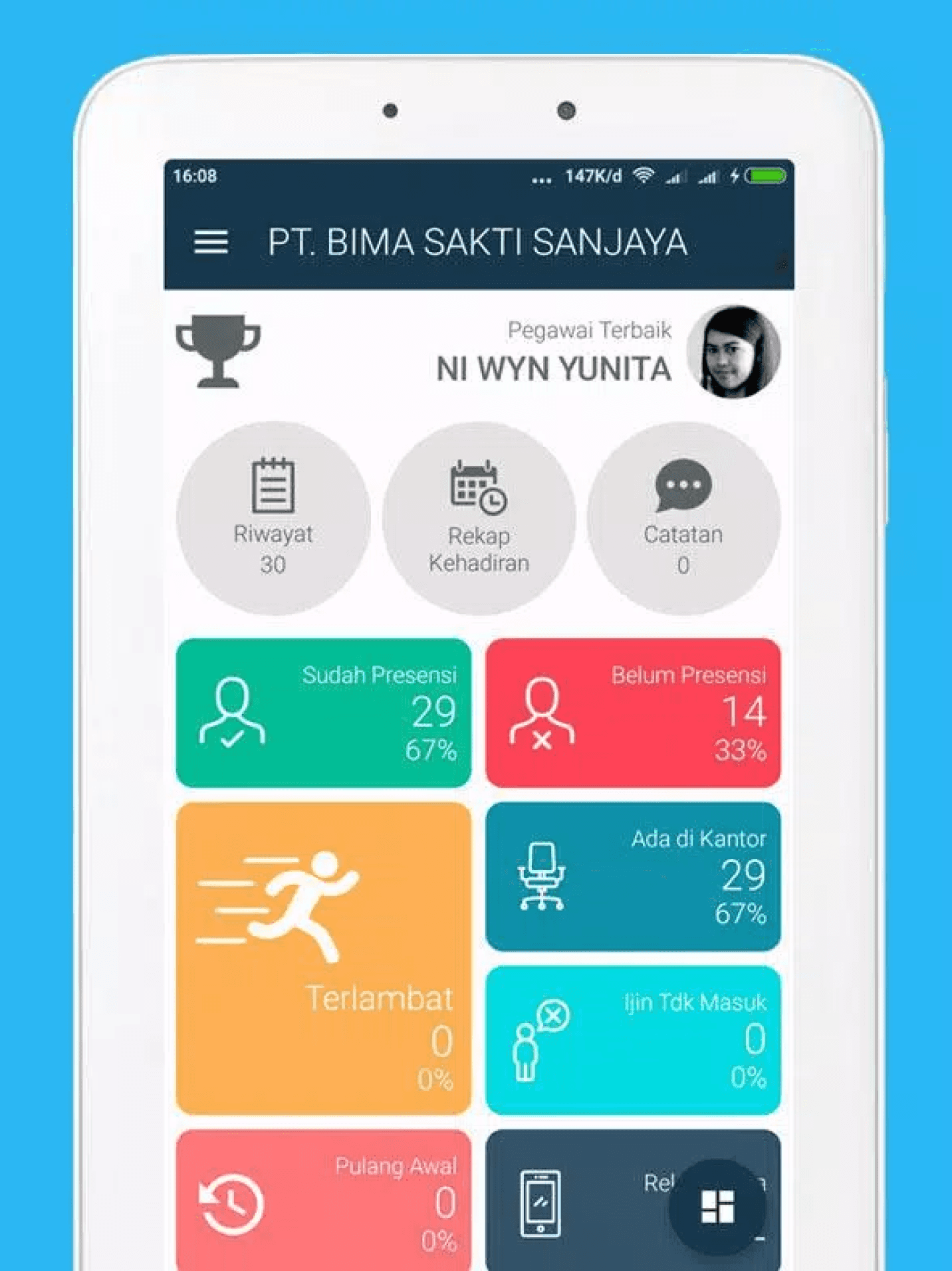
The company (BSA) had products (Smart Presence) that focused on presence systems that couldn't be developed anymore for one reason or another. So the company wants to make new products to make it delightful modern app that works completely as HRIS. Where the two initial modules of the product being developed are attendance and payroll modules.
The Challenge
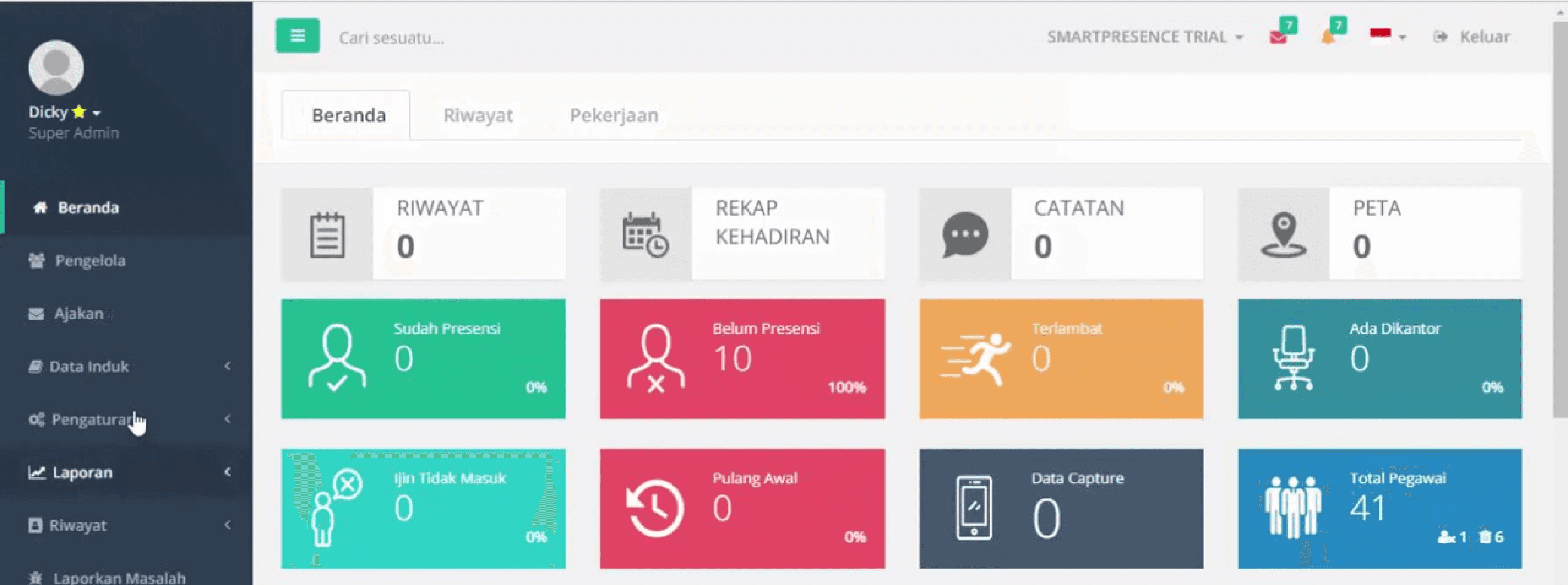
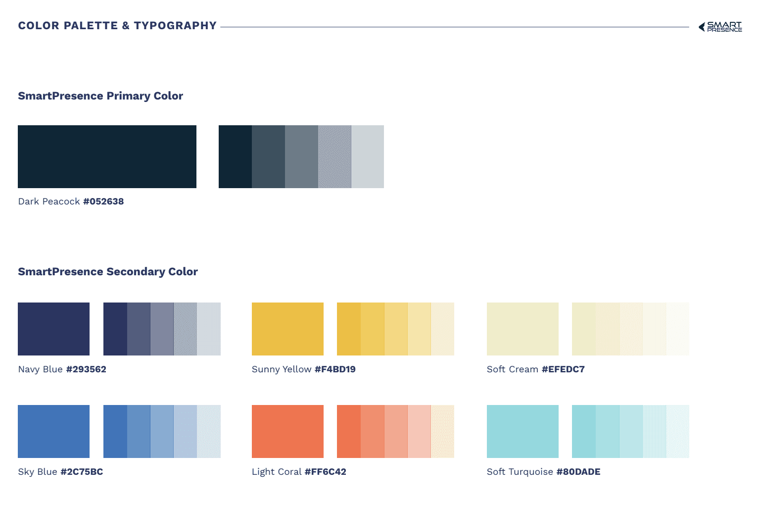
Presence products owned by the previous company did not have a system design. The product has no style guides, components and others. Meanwhile, this new product (Kolegahr) were asked to create a system design with the old product’s brand guidelines. So, I found it difficult to design the Kolegahr system because there was no consistency in the product.
In addition, in the go to market strategy process, based on the evaluation results, there were requests from stakeholders to make changes to product colors. So there needs to be adjustments in terms of color styles and some of the assets used.
Approach
Audit brand guidline
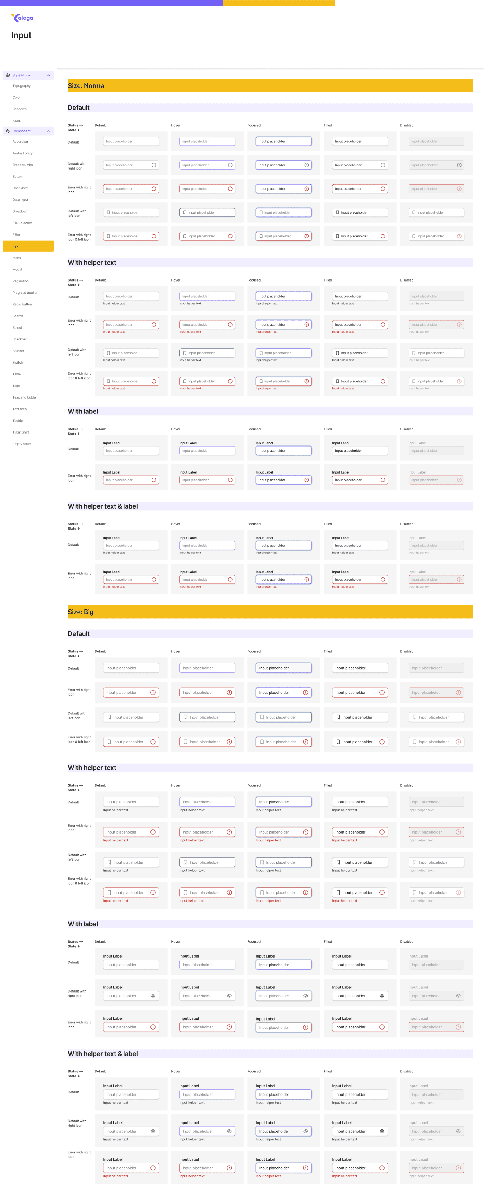
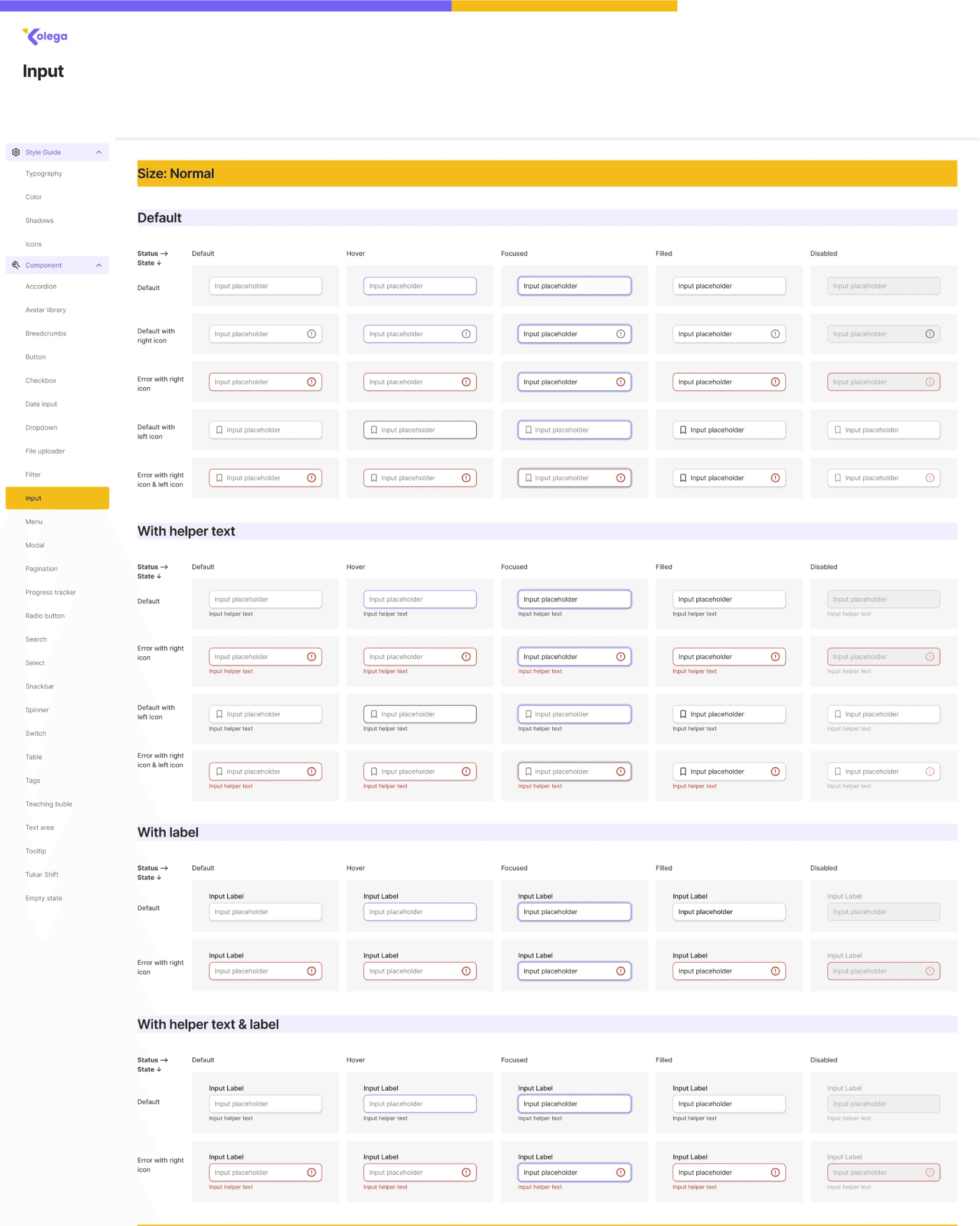
Explore and build UI components
Documentations
Implementation
Evaluation, research and design exploration (new color)
Rebuild UI design system
Implementation
Output
Produced 4 design system libraries (2 for the website platform and 2 for the mobile platform). Where the difference between the two system designs is the style guide.
Outcome
The design process becomes faster and all components are more consistent in each state and type. In addition, the process of changing the color of the system design is also much easier to work on because there is already an existing design system so that the library swap process becomes easier.
Audit User Interface Based on Brand Guideline
Design and Brand Guideline Analysis:
The color style on the user interface does not follow the brand guidelines. So the colors used on landing pages, Instagram and others are not the same as those used in the product user interface.
There is no consistency in the use of components. So that the components on one page with other pages can be different.
Explore and Build UI Component
There are several things that I did in exploring system design:
Doing brainstorming on design systems used by other applications in the figma community to learn the types of components that exist on the website and mobile app platforms
Participate in a system design tutorial class to simplify the process of creating a design library
Pay attention to functional aspects by creating component libraries that are often used to increase time efficiency in designing
Supporting aspects of flexibility to facilitate the process of making mobile app system designs adapted from website system designs
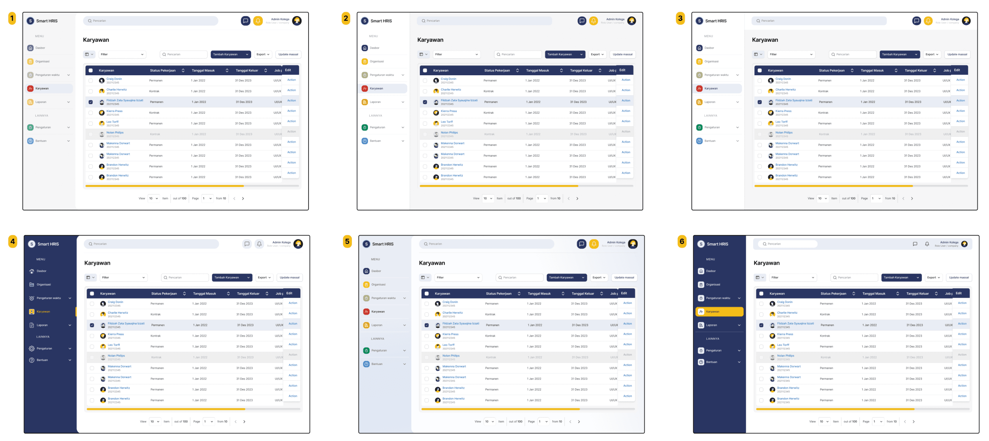
sidebar and navigation bar exploration
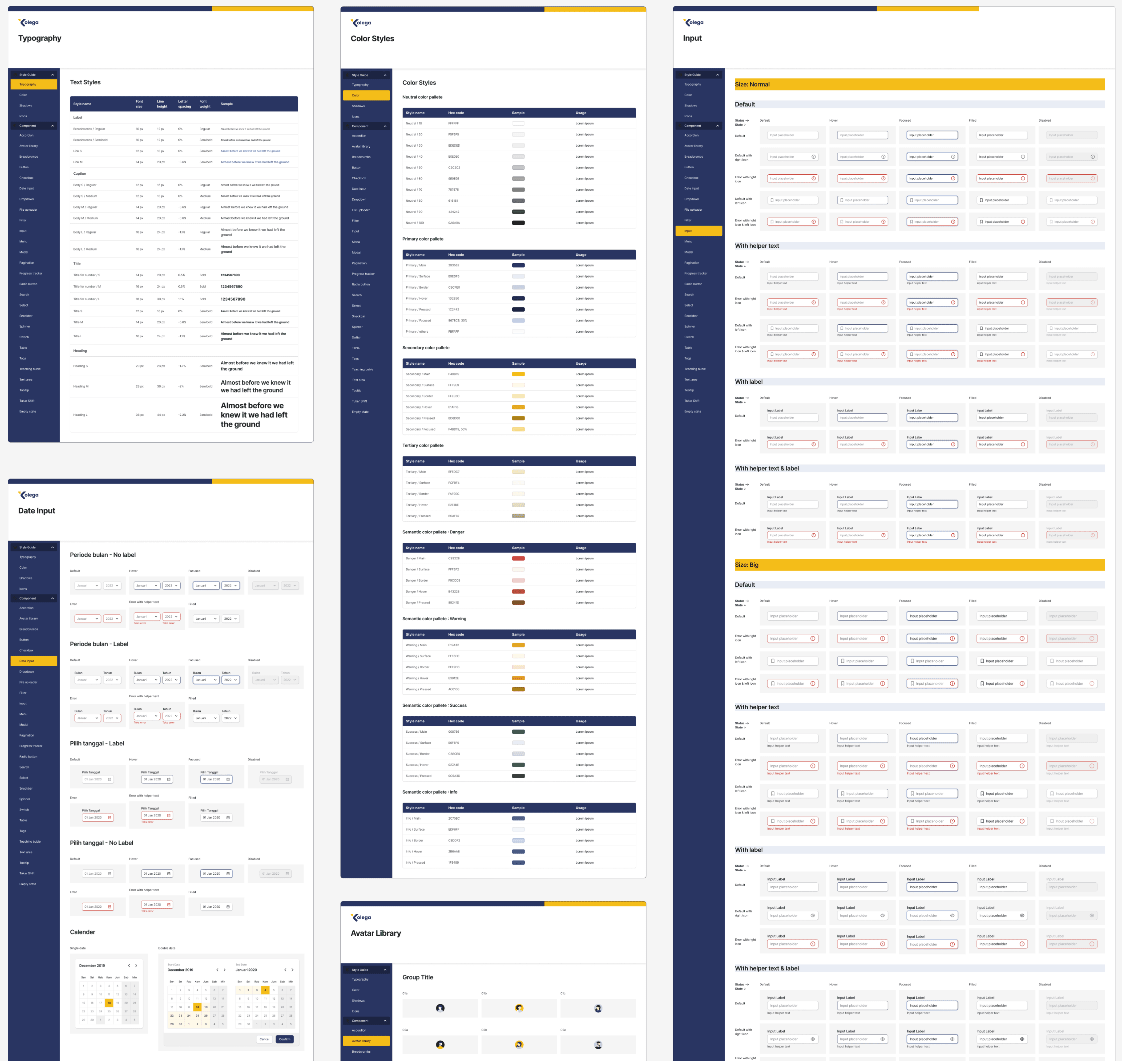
Documentation
After creating a design system, the next process is making documentation. This aims to make it easier for the development team and other design teams to read the library design system.
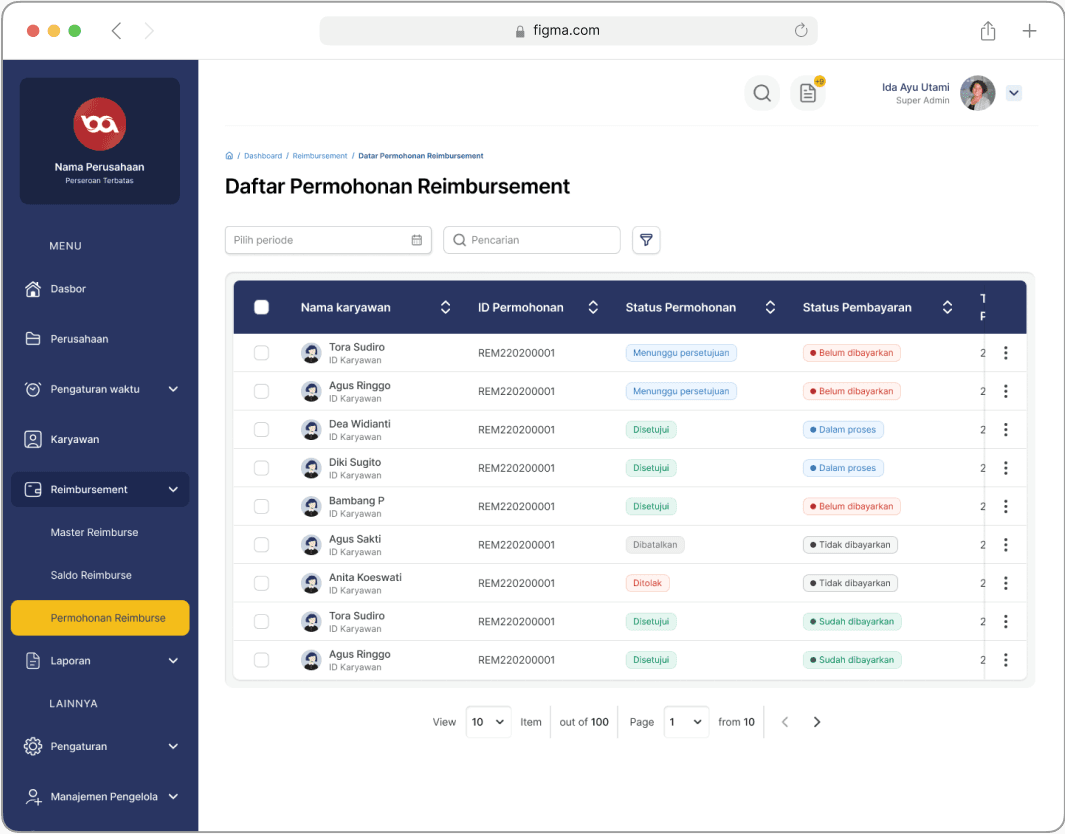
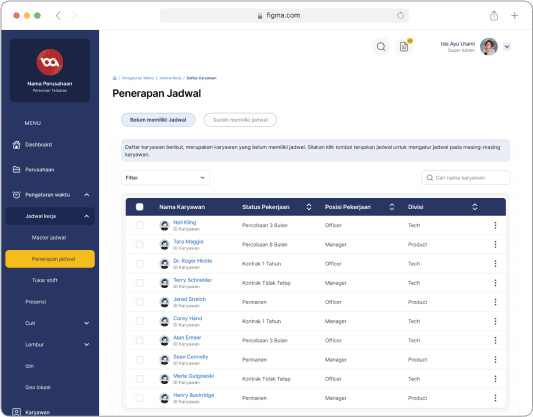
Implementation
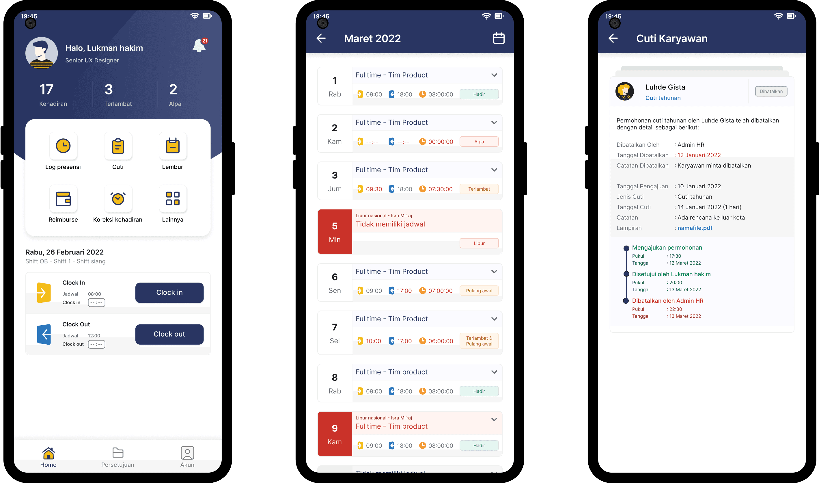
Mobile App Interface
Mobile App Interface
Evaluation
After the design is implemented and the product has been used within the company for several months. In the discussion on preparations for going to market, there was a request from stakeholders to create a new brand guideline. So it doesn't use the brand guideline of previous presence products. After going through many discussions with the design, product, marketing and stakeholder teams, the design chosen is a design with new color styles. However, it does not change the entire existing design components. So that it is an adjustment to the style and existing image assets.
Design Exploration (New Color)
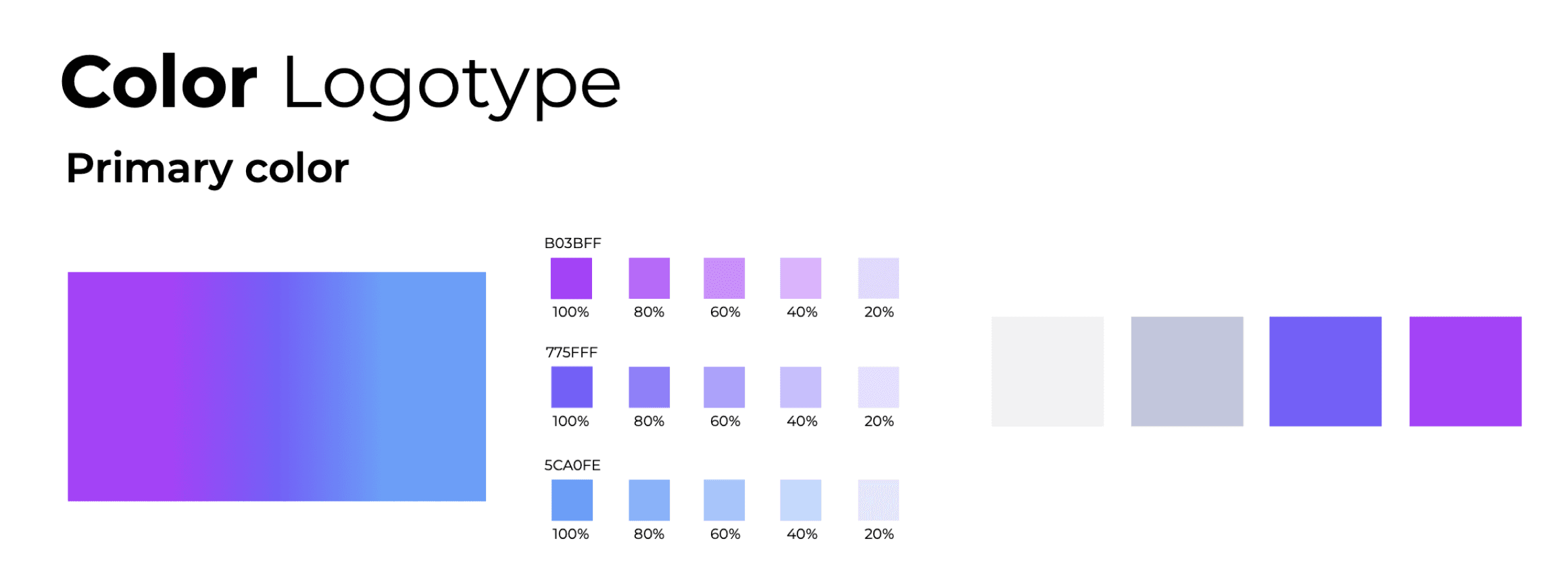
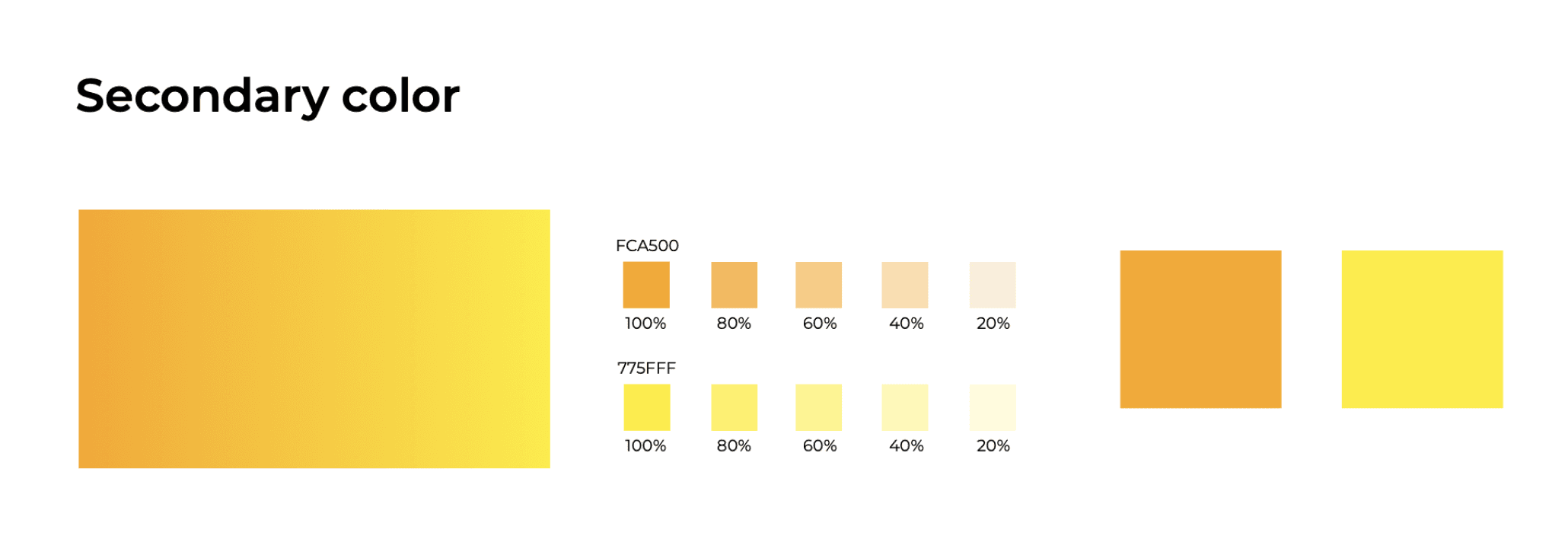
New brand guideline
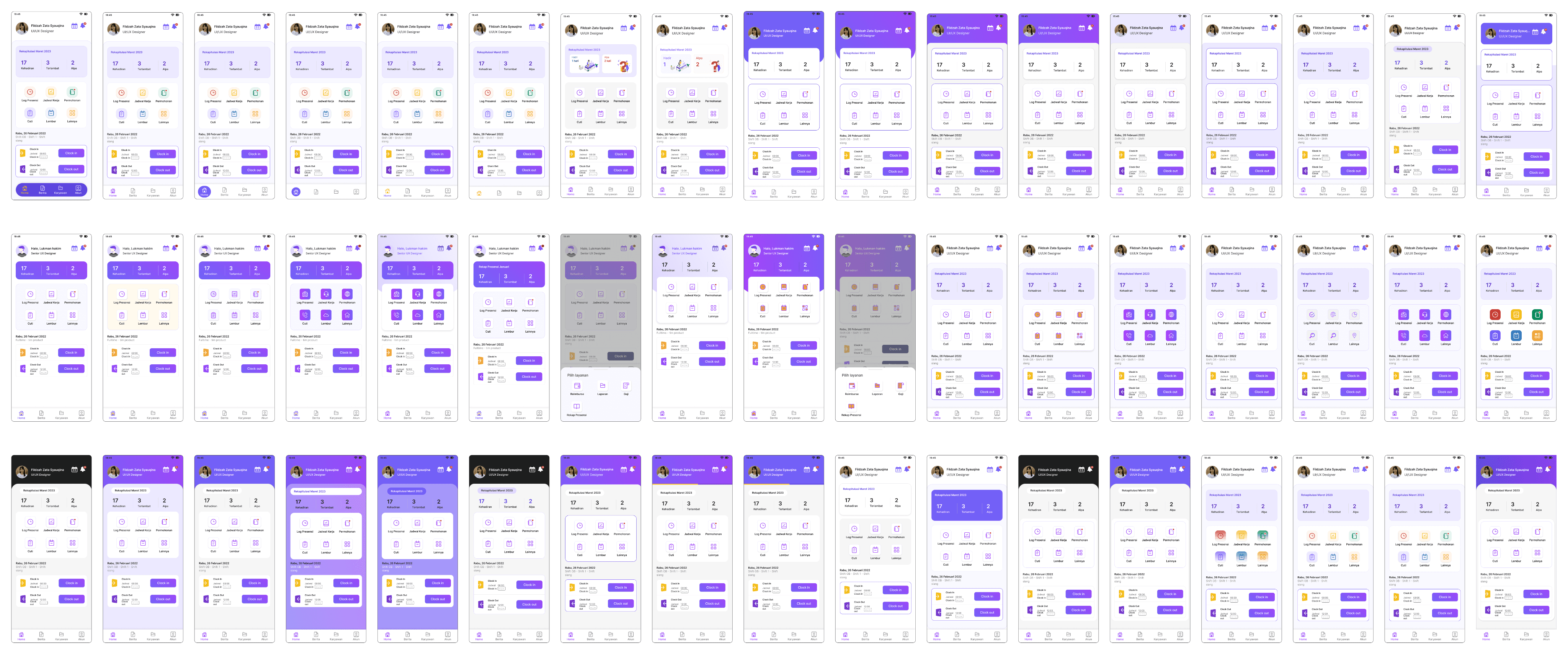
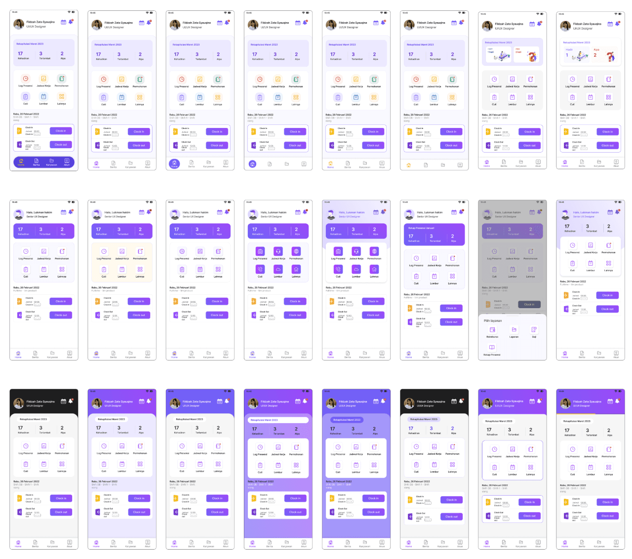
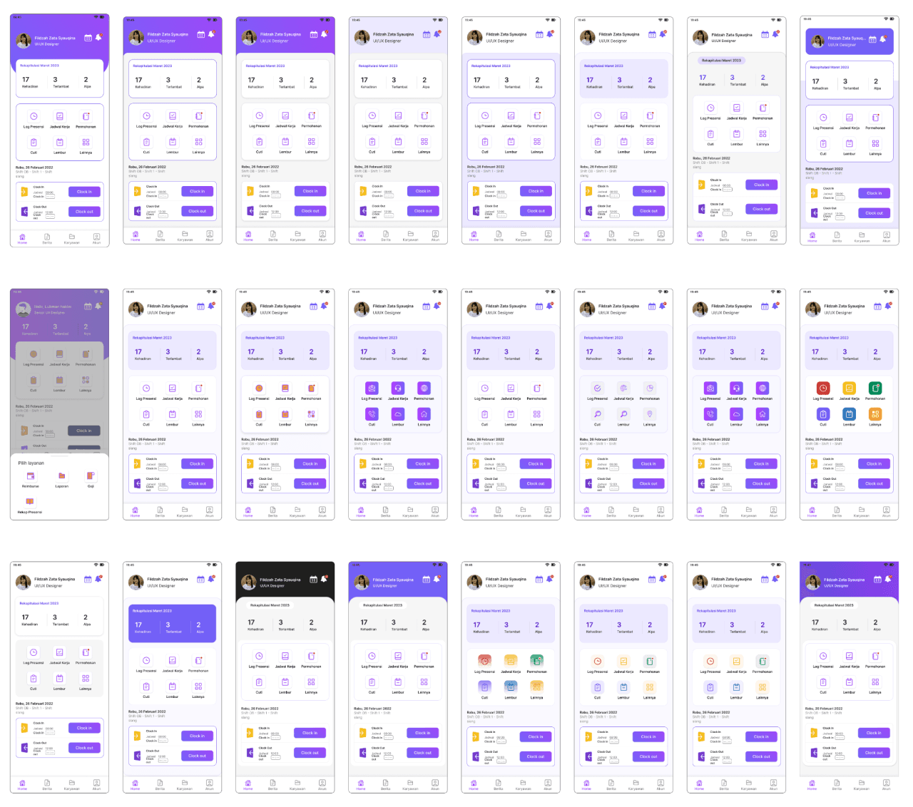
In doing exploration, I coordinated a lot with the marketing and communication team. The color composition exploration was carried out based on the brand guidelines made by the marcom team. Several explorations were carried out to find the percentage comparison of purple and white colors in the interface. Based on the several color exploration options, it is discussed with stakeholders for approval of the color change process in the design system.
Mobile app design exploration
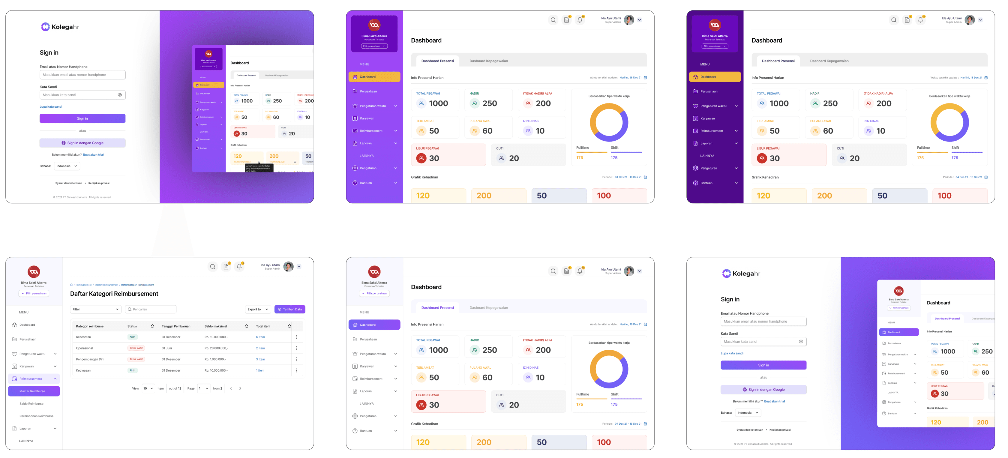
Website design exploration
Research
After doing the exploration, the research process is carried out through the survey method. This research aims to find out the needs or activities that are most often carried out by employees when accessing the Kolegahr mobile app. The survey process was conducted on 10% of user representatives.
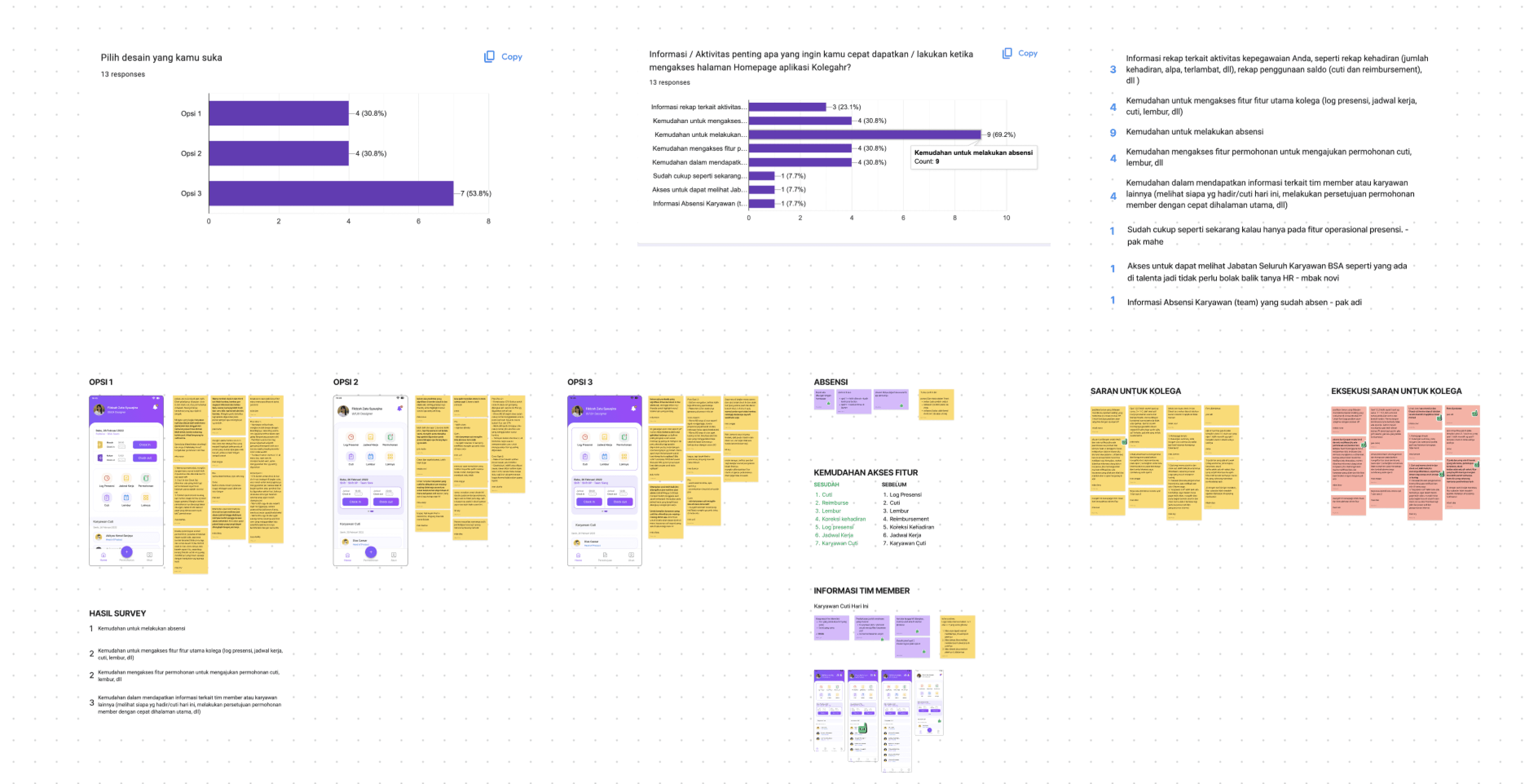
Processing of survey results
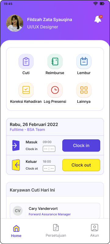
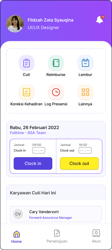
The results of the survey show that the main needs of employees when accessing the homepage are:
Ease of attendance
Easy access to Kolegahr's main features
Ease of submit for leave, overtime, reimbursement and attendance correction
Ease of getting information about team members, peers and managers (employees who are on leave today and requests from team members)
Implementation of research results
Re-Build Design System
The process of changing the system design is starting by duplicating the existing system design library. In the new library, there are changes to the color styles and font sizes. Because the new design has a purple A to purple B gradient color with a composition of 70% white and 30% purple. So it still needs adjustments to some existing components and page designs. Apart from that, there are still adjustments to the image or illustration elements used on the website and mobile app. Currently, the new design library is being gradually implemented in website and mobile app designs for the next version.
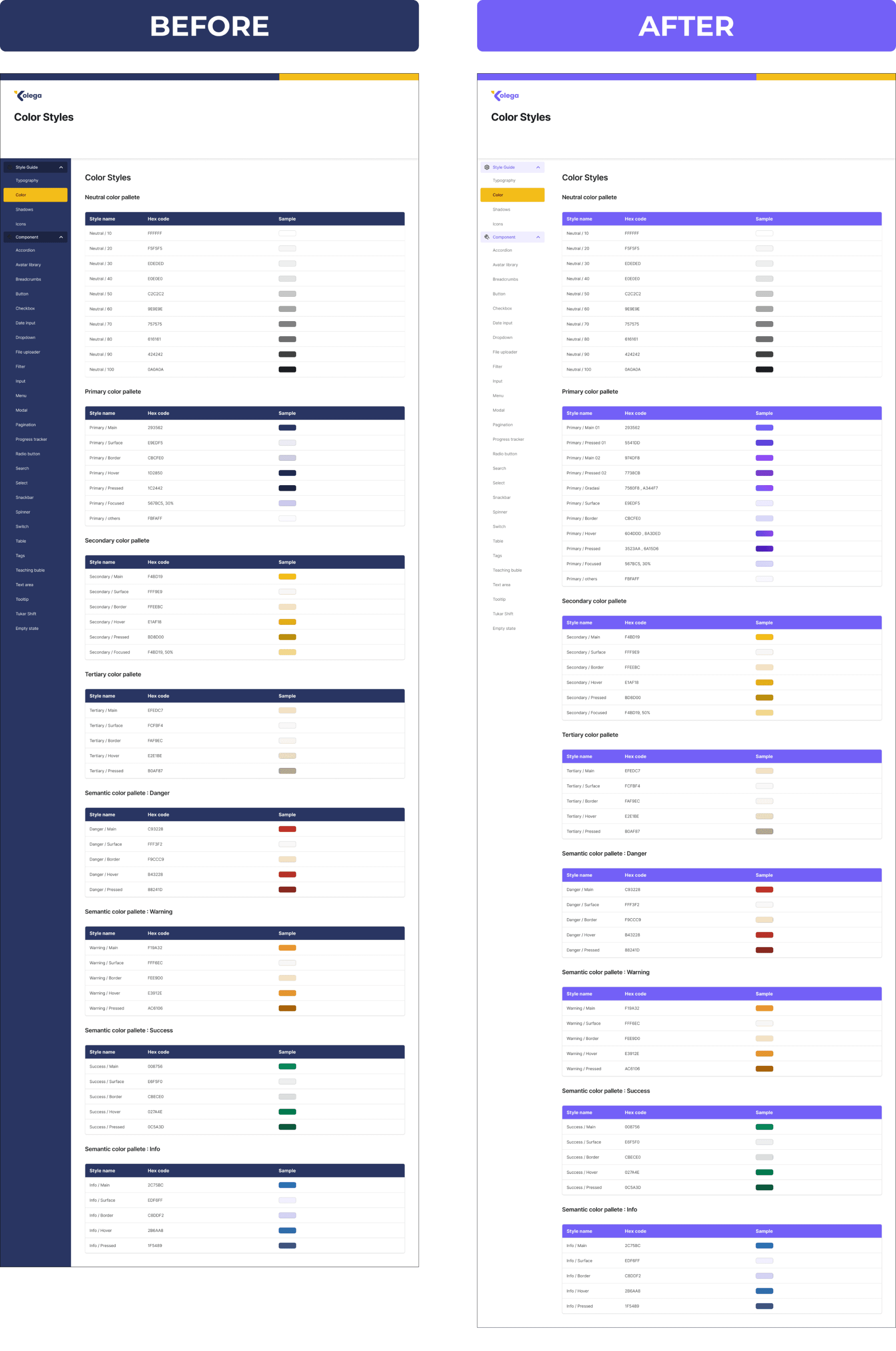
Examples of design system documentation
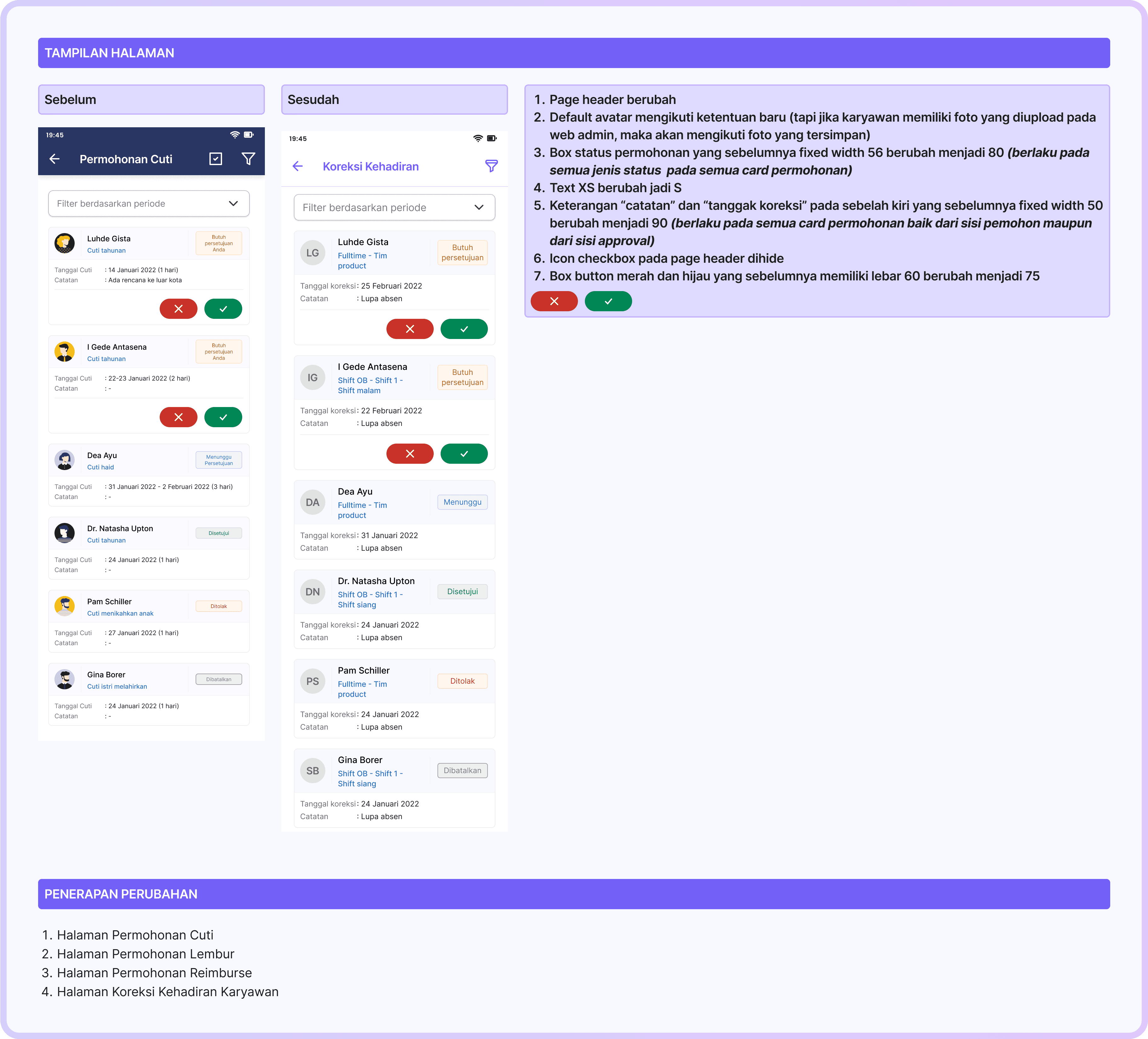
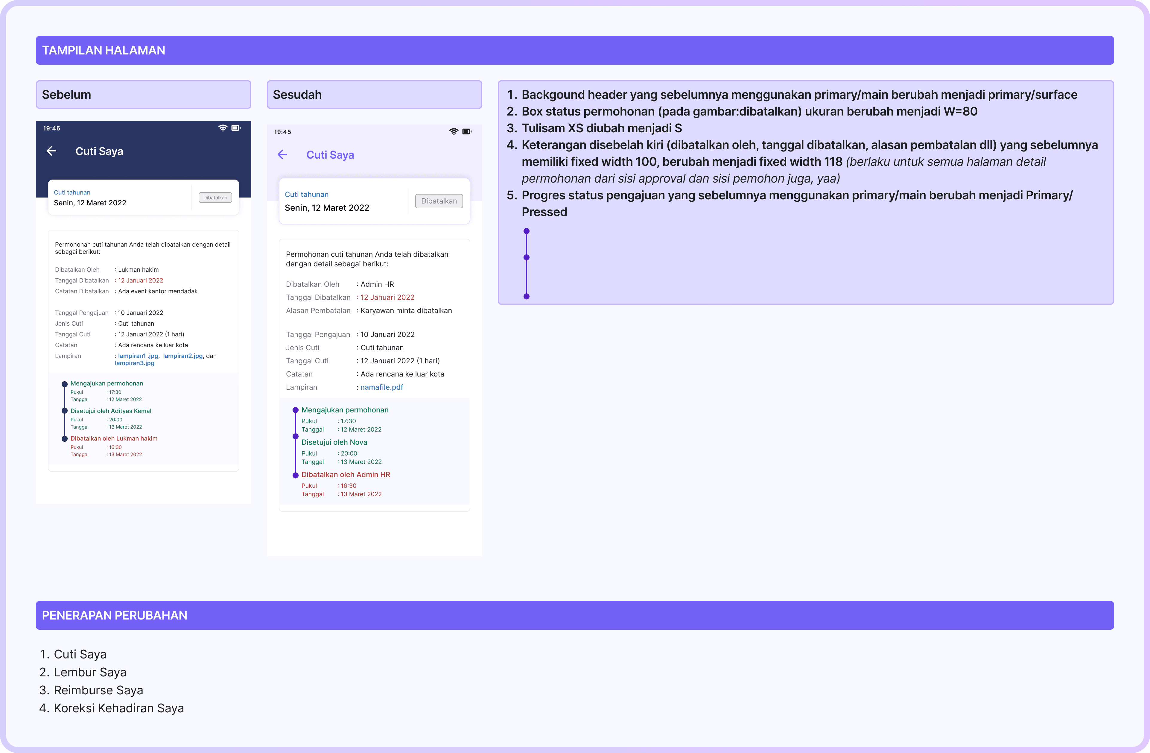
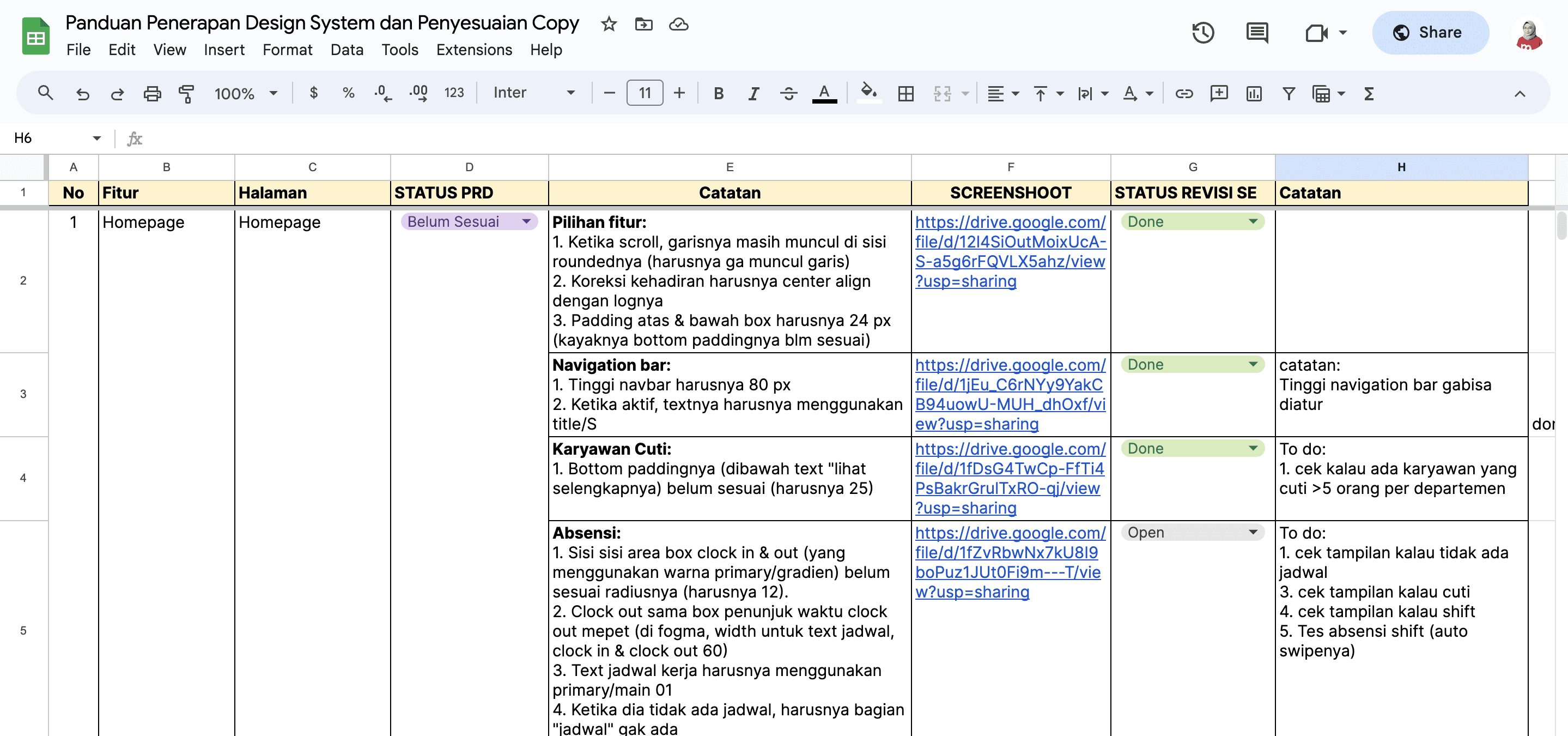
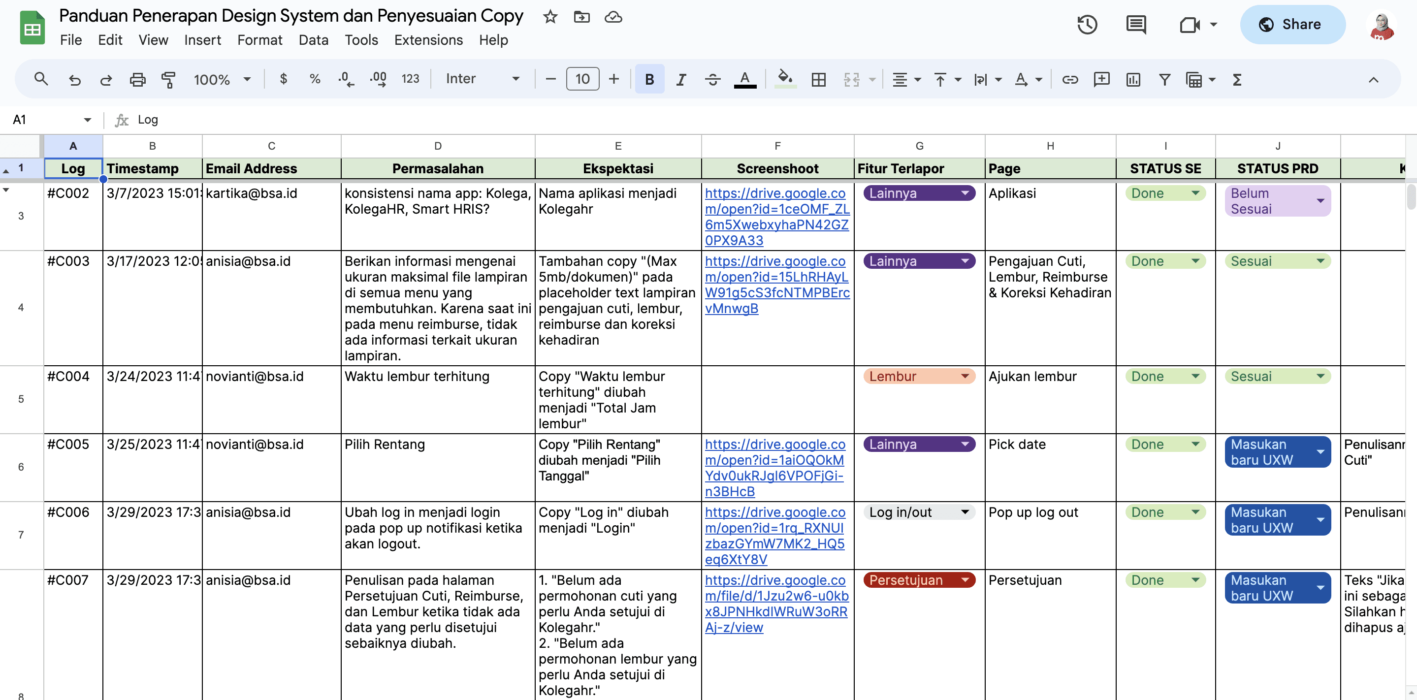
Apart from updating the system design, I also created guidelines for implementing the new system design. This guideline helps developers to know where design changes occur in any part of the application. The implementation of this new color was also accompanied by improvements to previously inconsistent copy.
Guide to implementing system design, copy improvements and reviewing system design that has been implemented by the development team
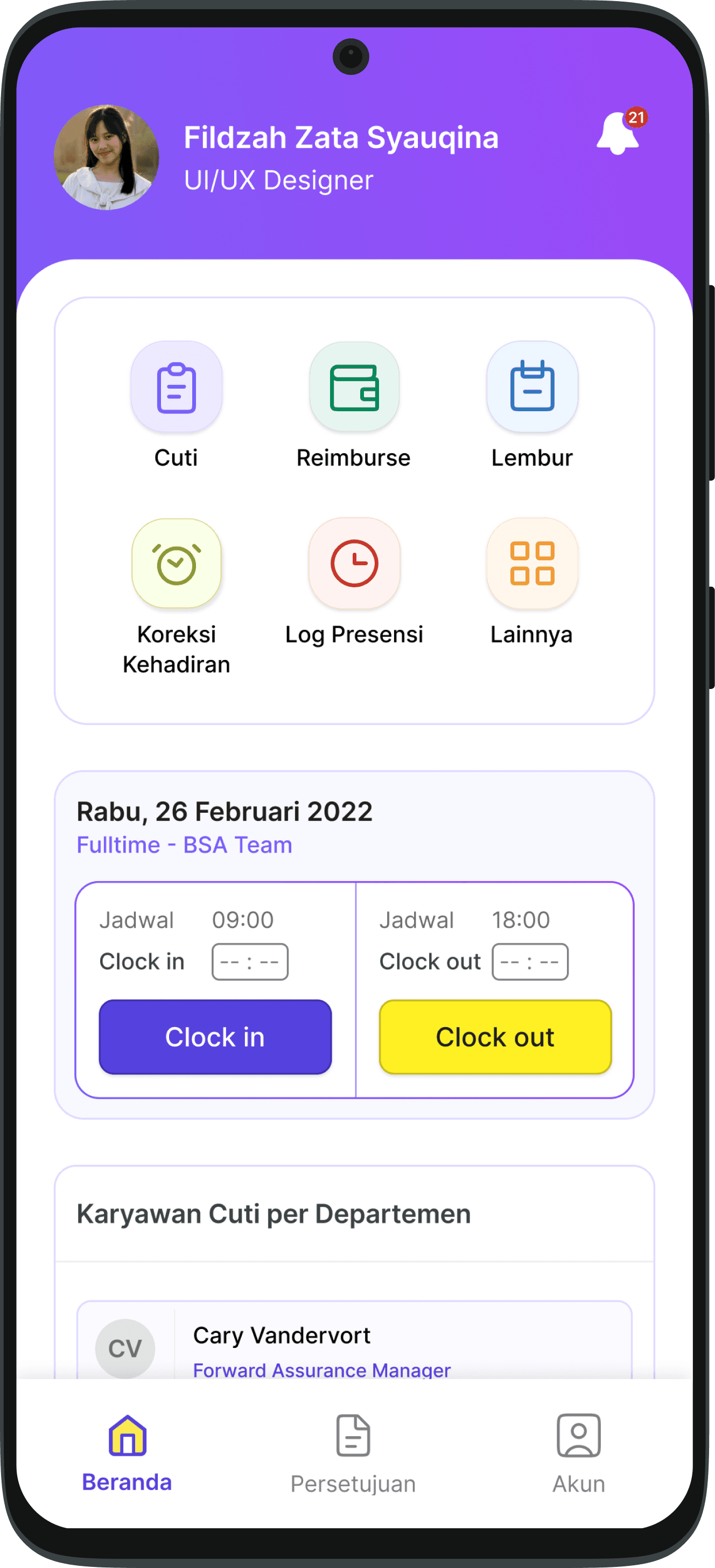
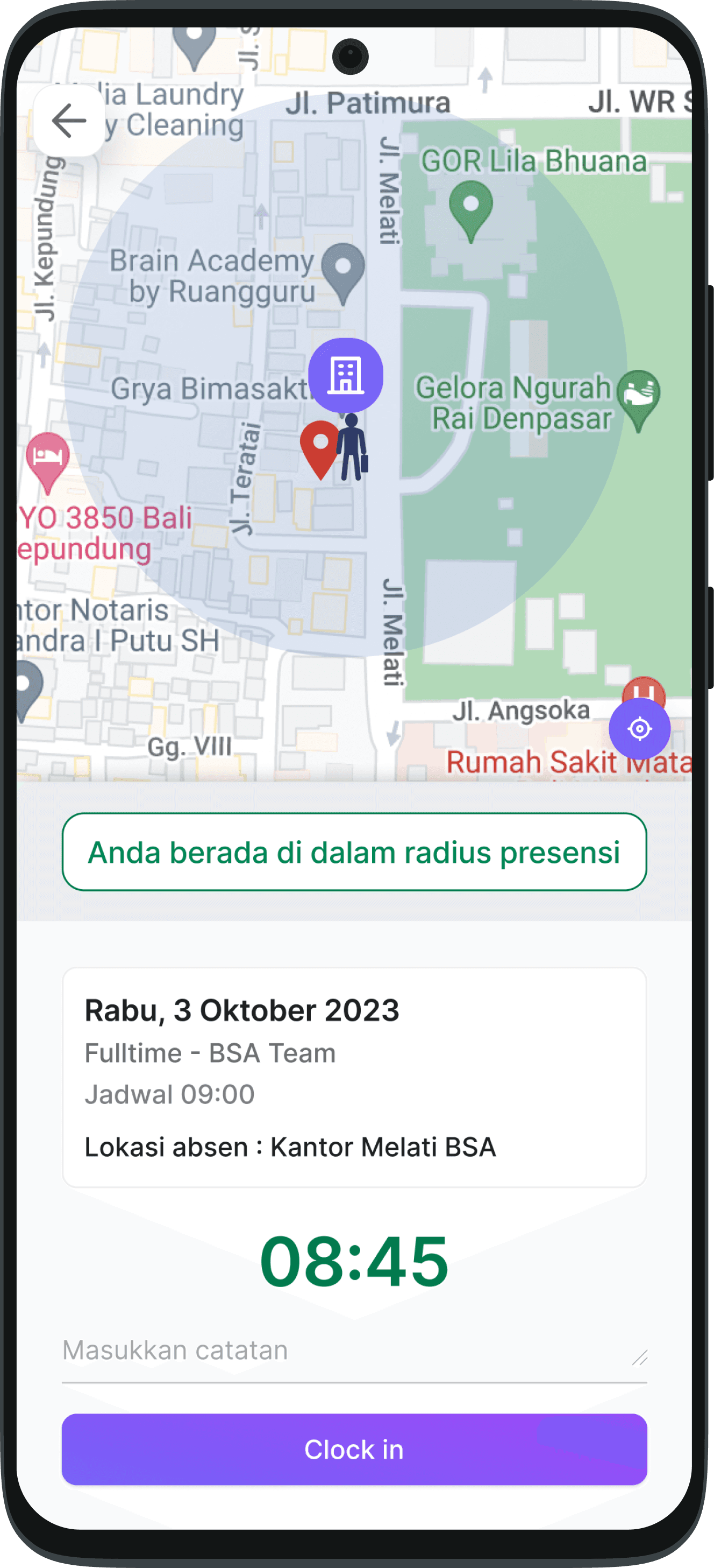
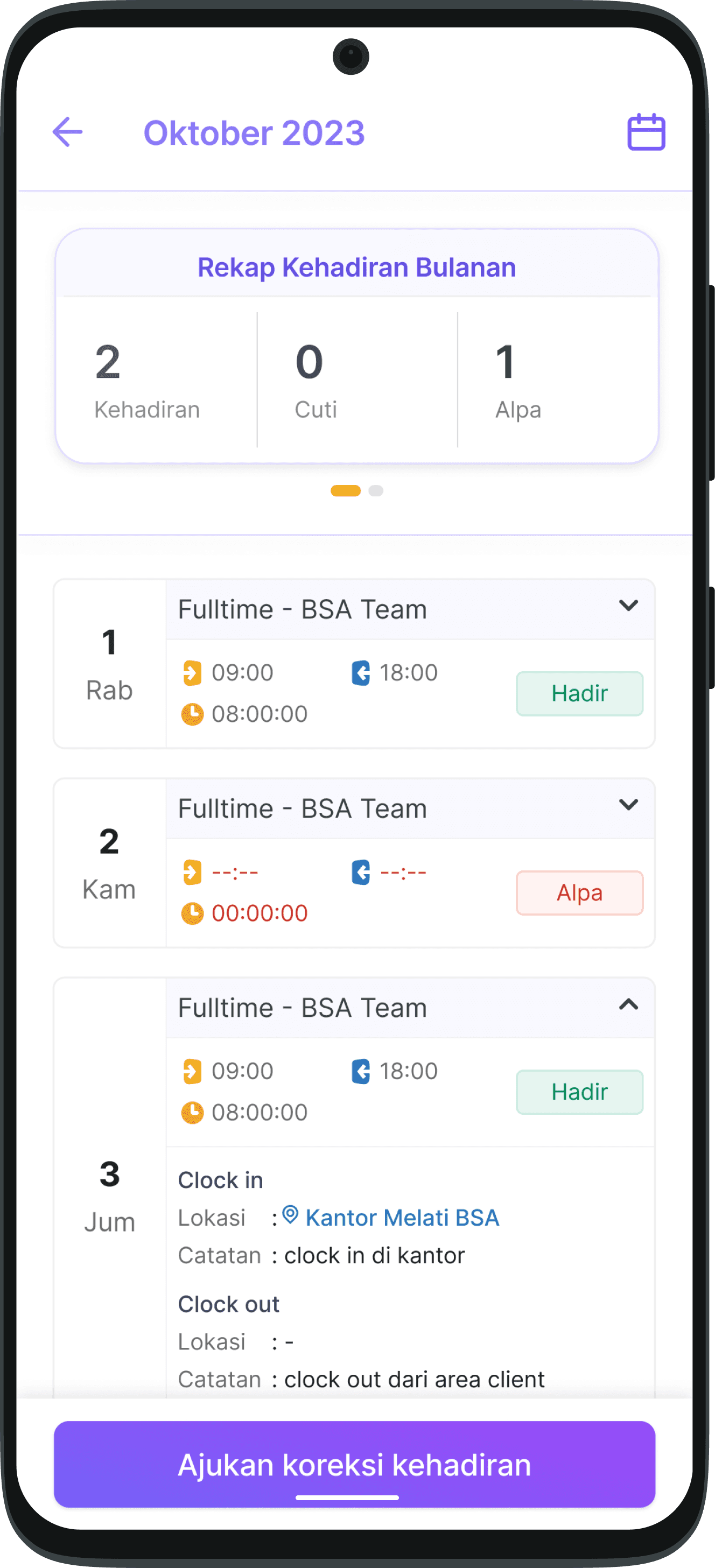
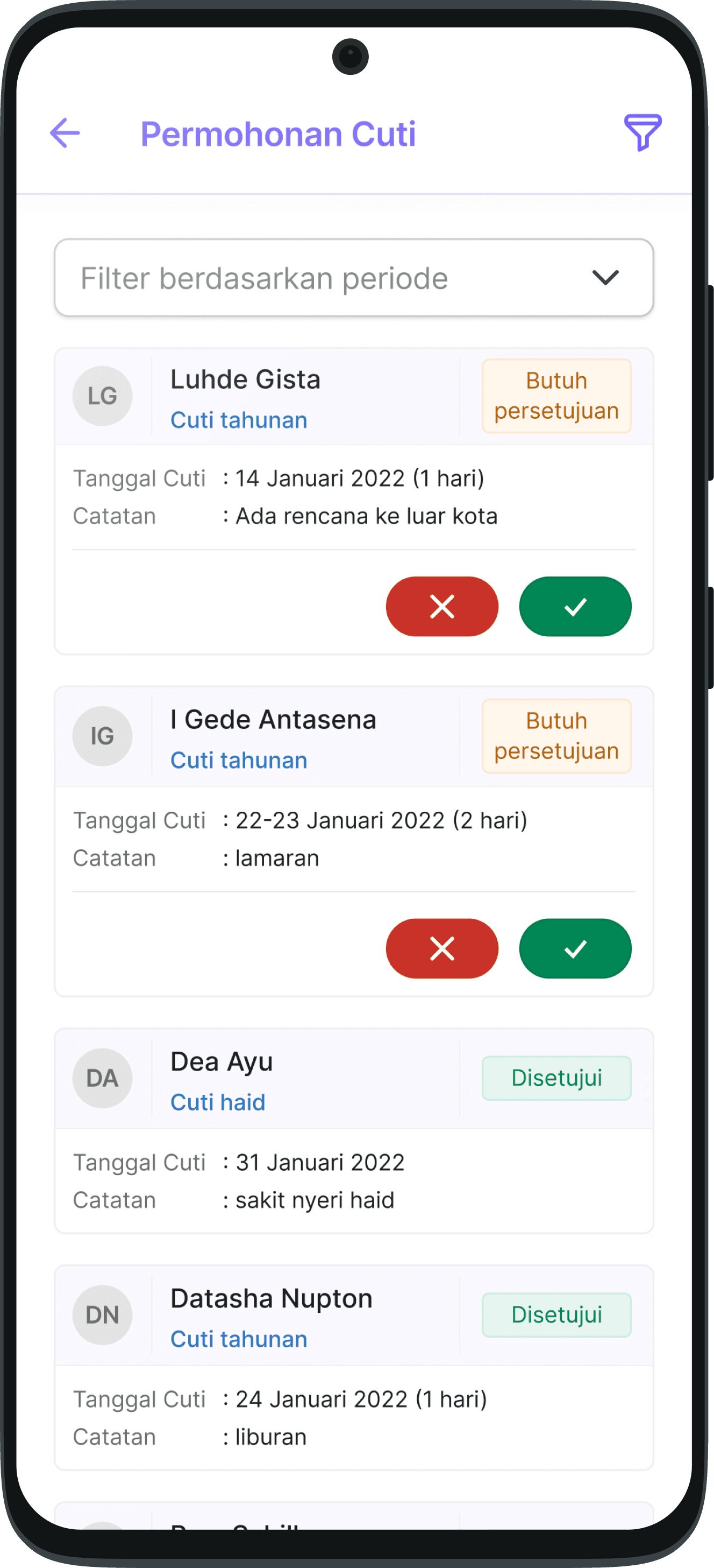
Implementation
The new system design is applied to the Kolegahr application after going through a research and evaluation process by the UI/UX team.
Implementation
Takeaways
Here’s what was working
The use of design systems in Kolegahr speeds up the design team process and maintains design consistency
Improving the font size and buttons on the mobile app has had a significant impact on the ease of users reading information on the Kolegahr interface
Here’s where we need continued iteration
Some copies in website still use English so it looks inconsistent. Evaluation of the language used, it will be very useful for users to understand and carry out tasks in the application if the language similarity is good
Improved breadcrumbs because on the website, breadcrumb improvements are needed to increase user accessibility in accessing pages on the website
Leason Learned
From the process of making this system design I learned that design systems has a big impact on the design process. Making a component master that can impact all existing components, really helps the designer if there is a change in a component or design. In my case, requesting changes to the brand guideline by stakeholders that occurred became much easier to do because previously I had made a system design. Thus, manual adjustments are only made to certain components or certain cases.
Made with
in Jember
