Improved user interface, wishlist and ePustaka features to enhance user experience in borrowing books
2021
Role
UI/UX designer
Timeline
3 weeks
Tools
Figma
Reading time
6 min read
Overview
iPusnas is the largest online library application in Indonesia. However, some users have complained about their experiences when using this application related to the interface design. This final project aims to identify any usability problems and improve the user interface of the application to provide a better experience for users using the design.
The Challenge
iPusnas which has been downloaded by more than one million users, received a rating of 3.6 (Google play store) and 2.9 (App store). Based on several reviews, this application has many problems including accessibility information for user.
Approach
Empathize (research)
Define the problem
Ideation
Prototype
Usability test
Output
Redesigned interface based on the main problems found in user research
Outcome
The four main problems found during the research can be resolved based on the UT results. In addition, there are several design recommendations based on the UT results.
Empathize
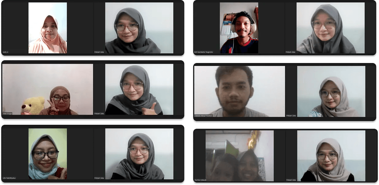
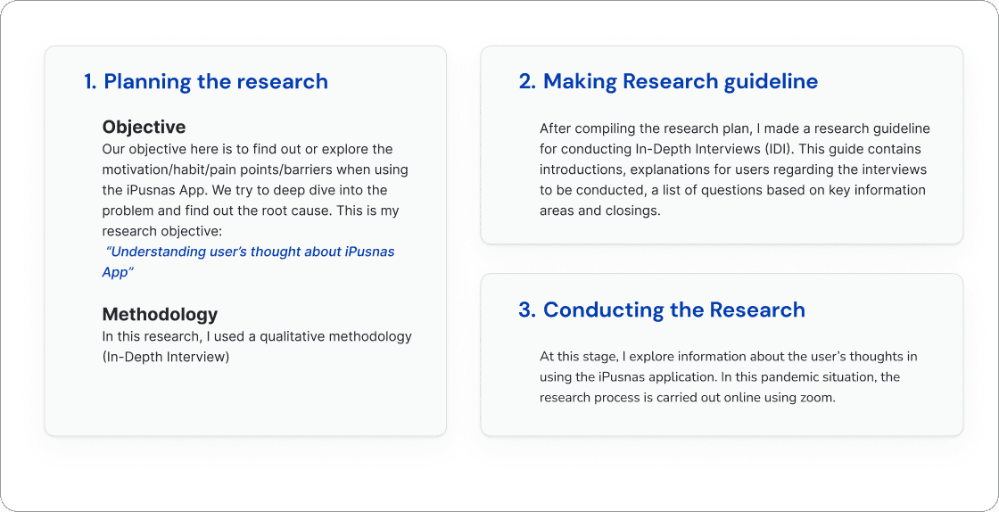
There are three stages of the research process that I did, namely planning the research, making research guidelines and conducting the research.
Define
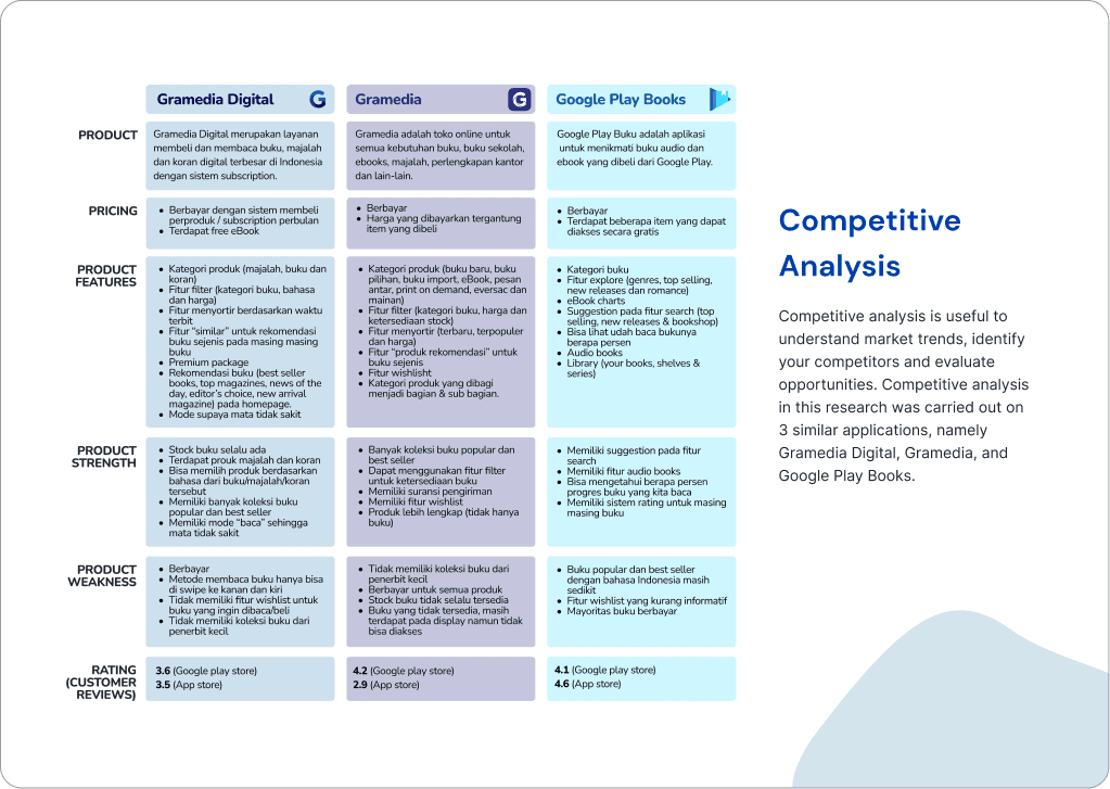
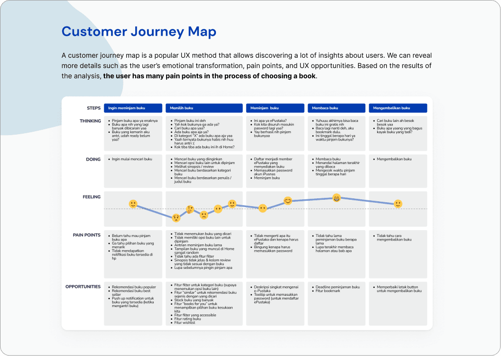
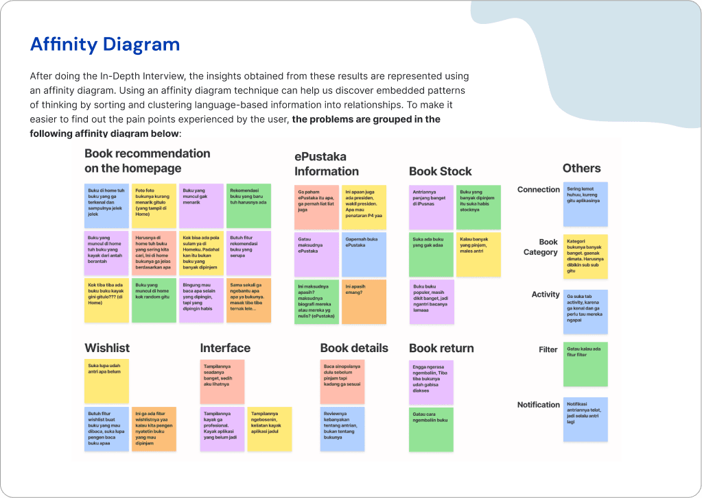
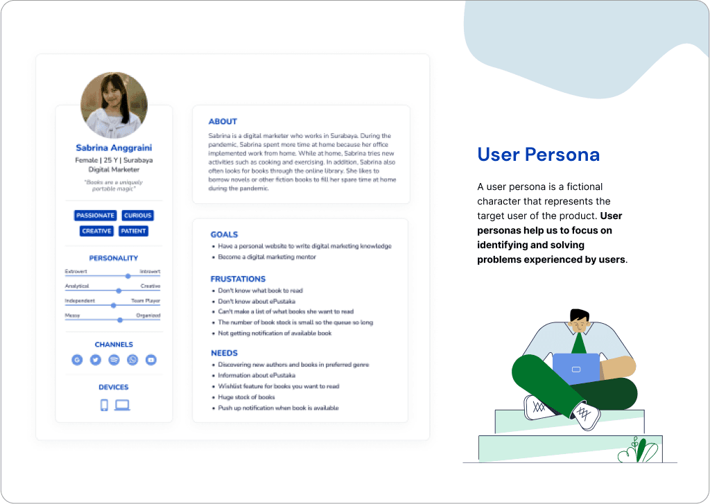
At this stage, I did competitor analysis, processed interview data into affinity diagrams, created user personas and customer journey maps.
click to see customer journey map, affinity diagram and user persona

Pain Points
Based on the results of the analysis using affinity diagrams and customer journey maps, it was found 4 main problems faced by users:
1
Users do not get book recommendations on the home page
2
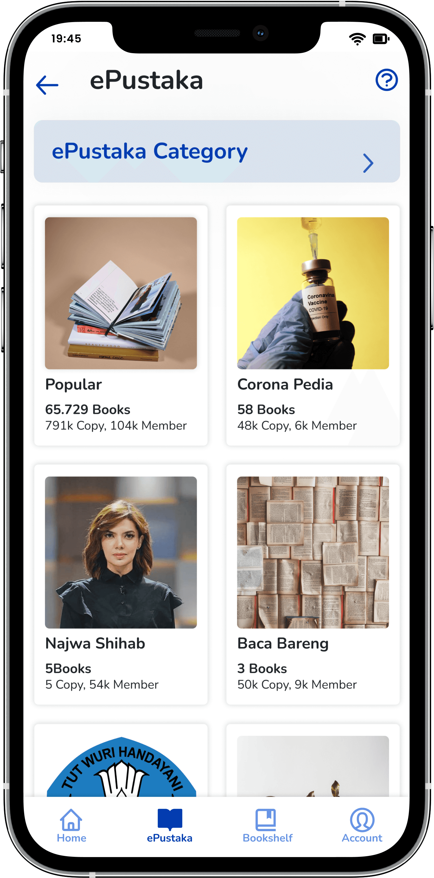
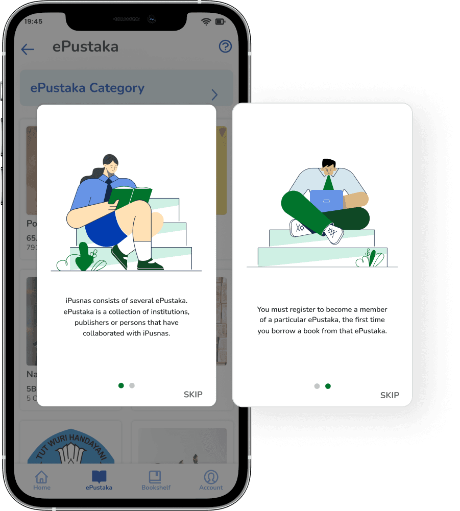
Users don’t understand what ePustaka is
3
Users forget which books they want to borrow
4
The appearance of the application is not modern
Ideation
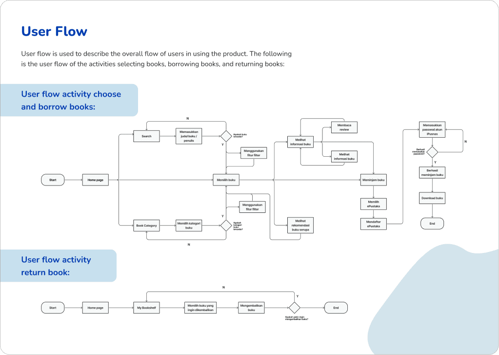
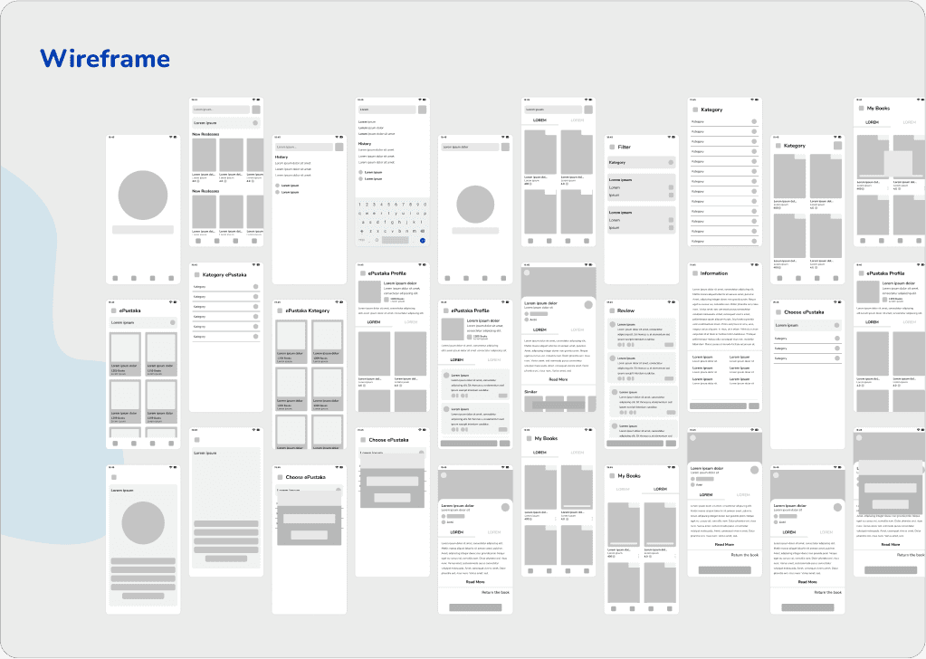
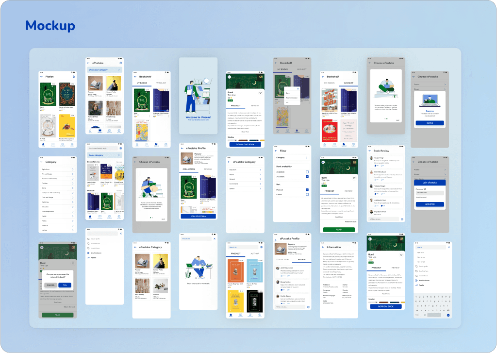
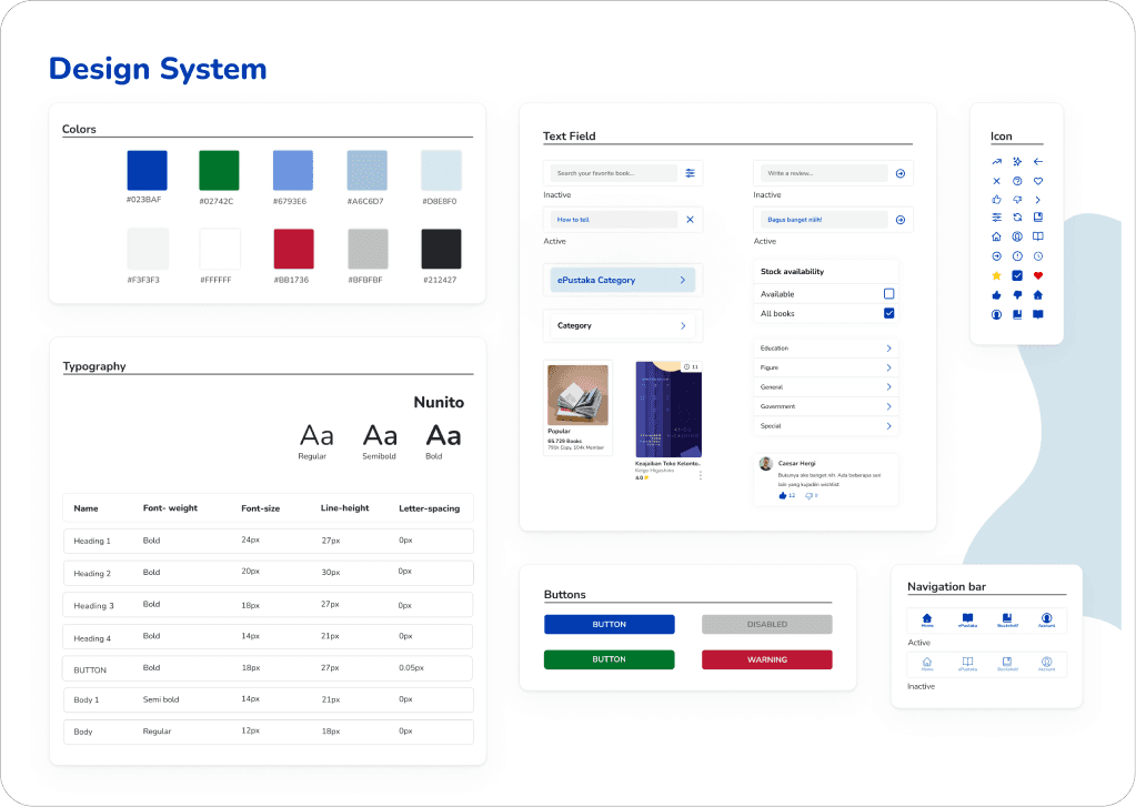
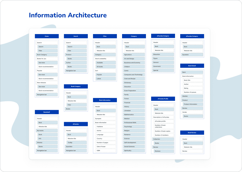
In this phase, I created user flow of choose, borrow books and returning books. Then, I create architectural information, wireframe, mini design systems and mock ups.
click to see wireframe, mock up and design system
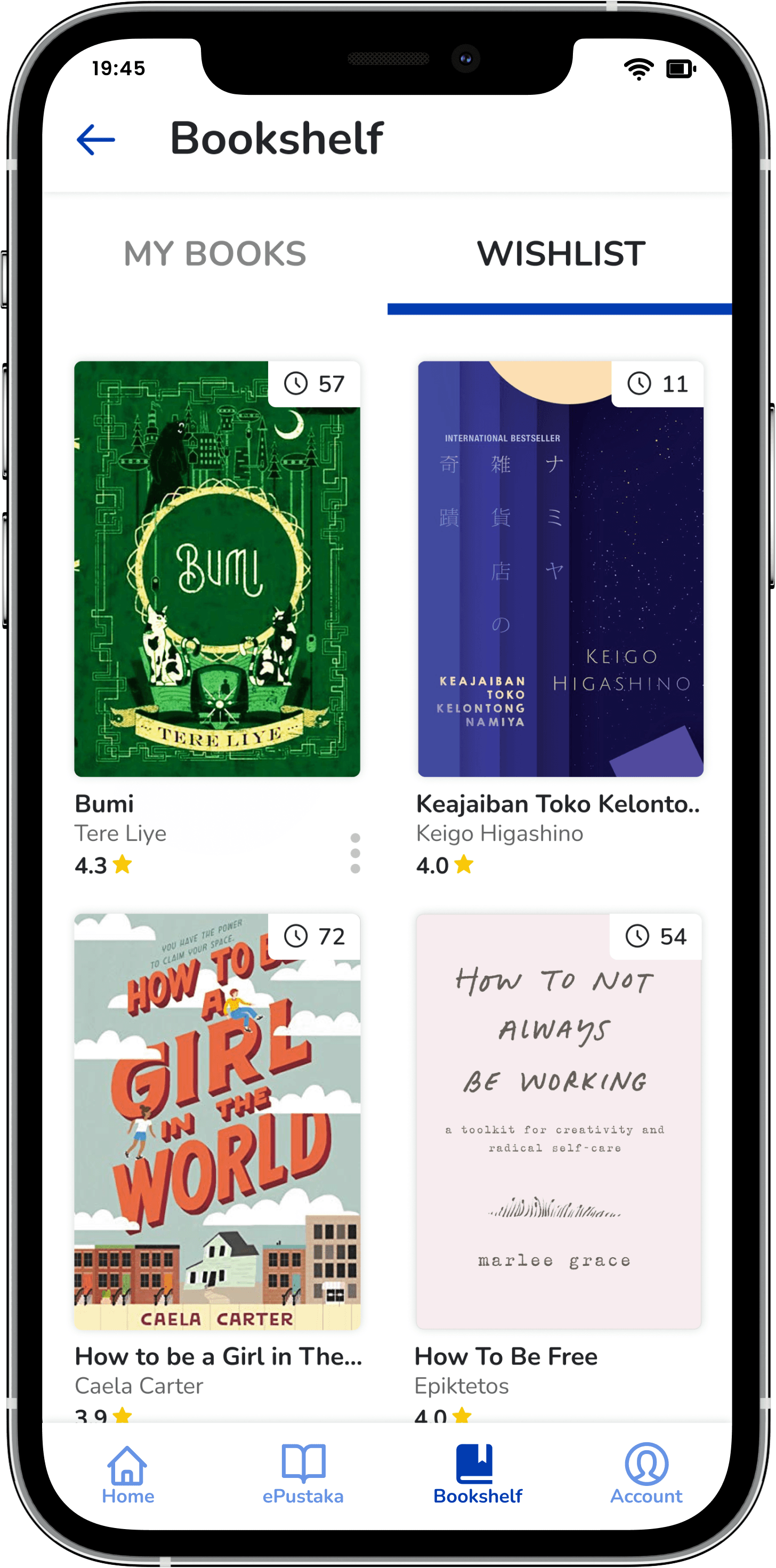
Save it for Later
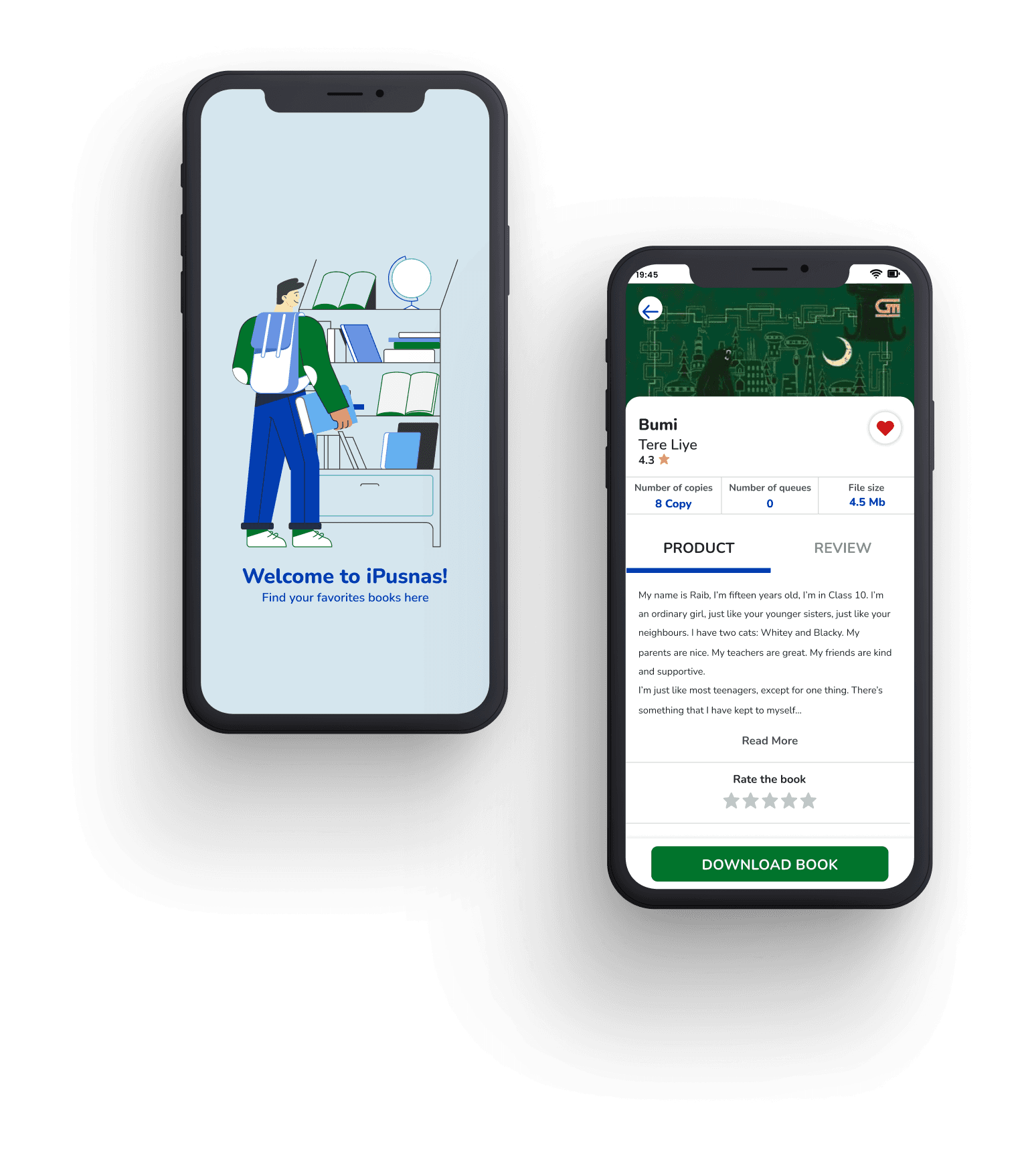
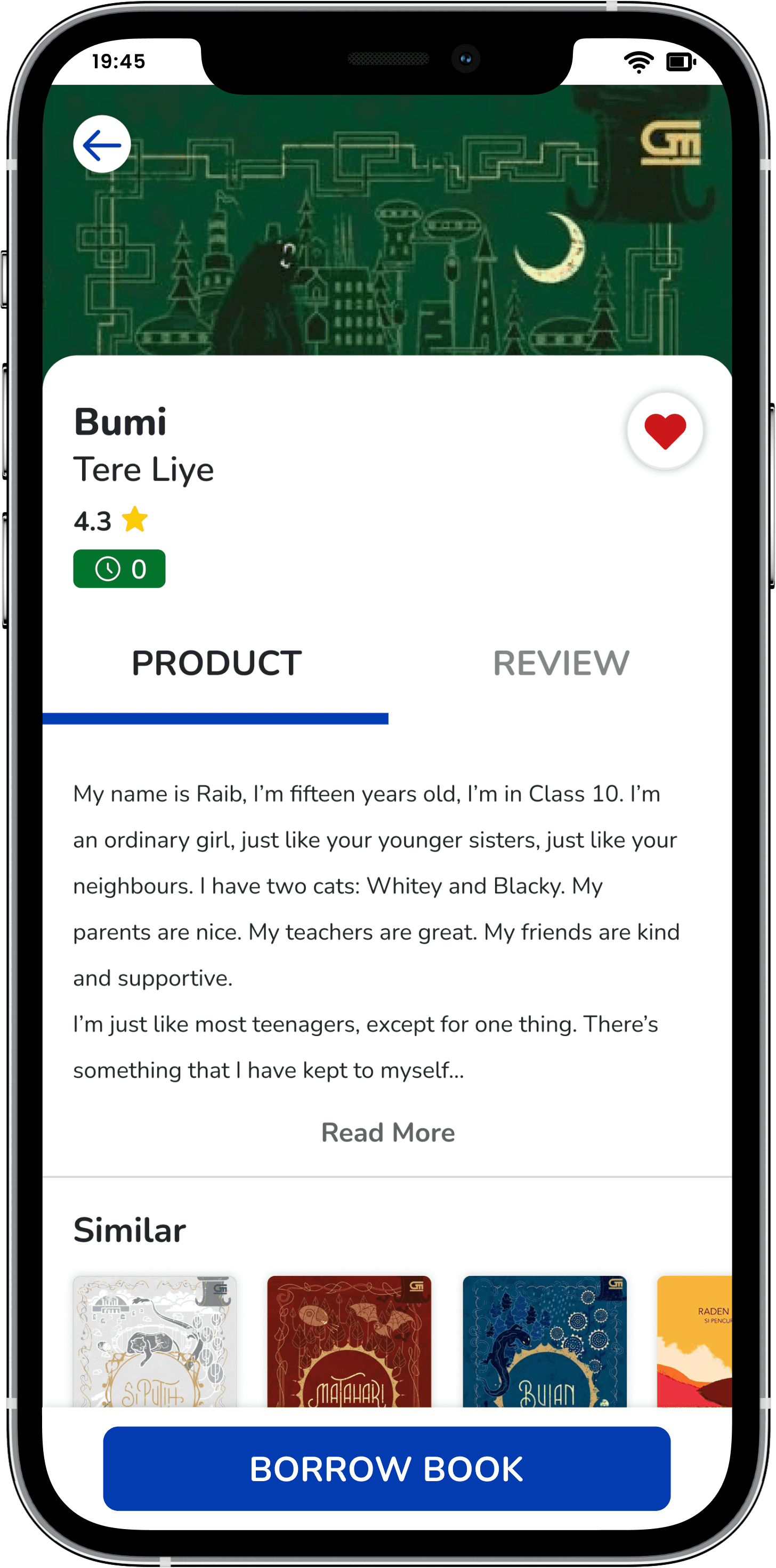
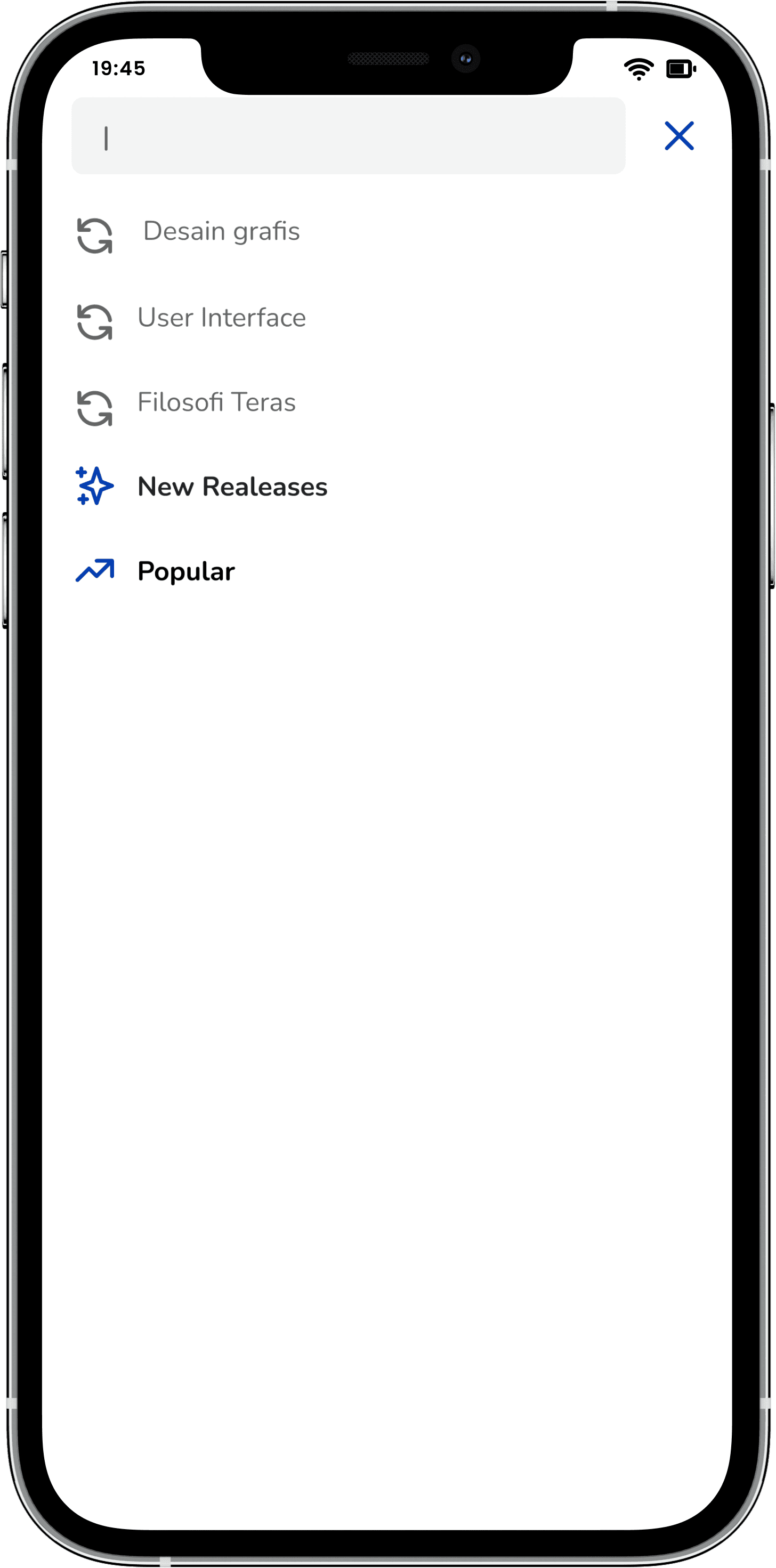
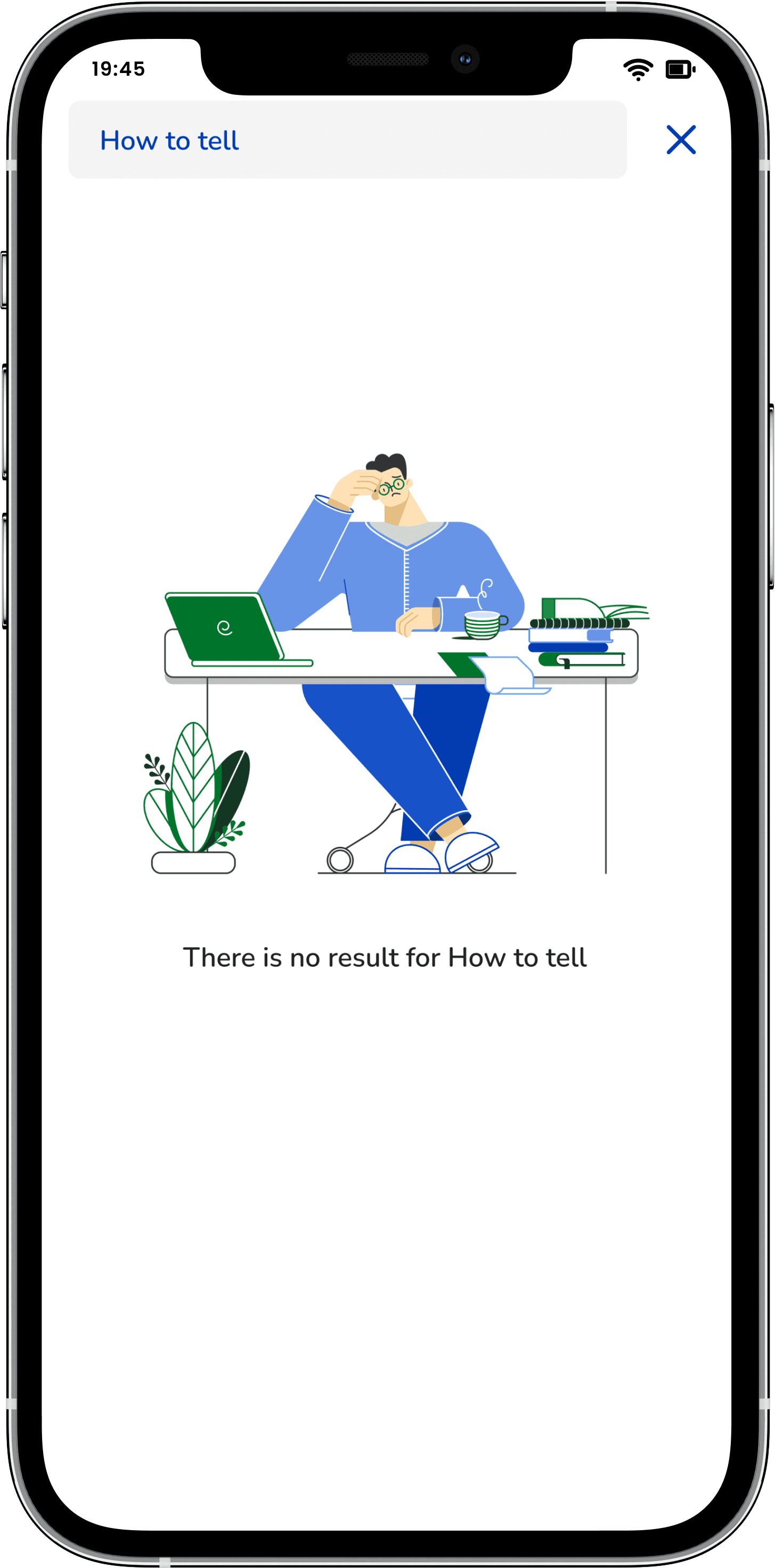
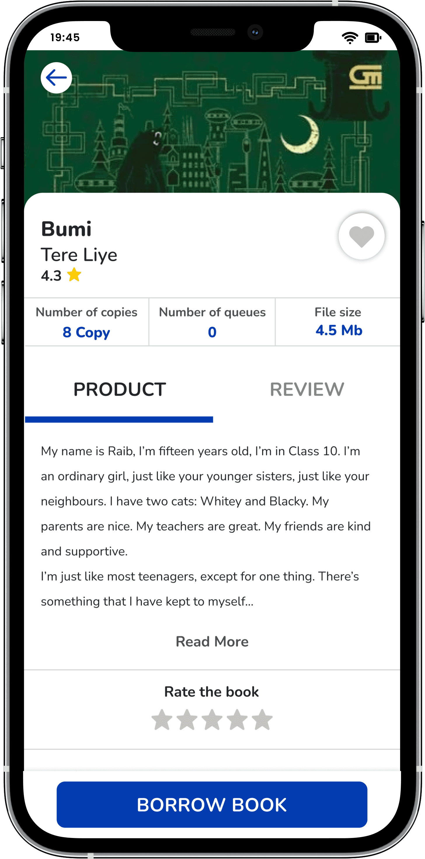
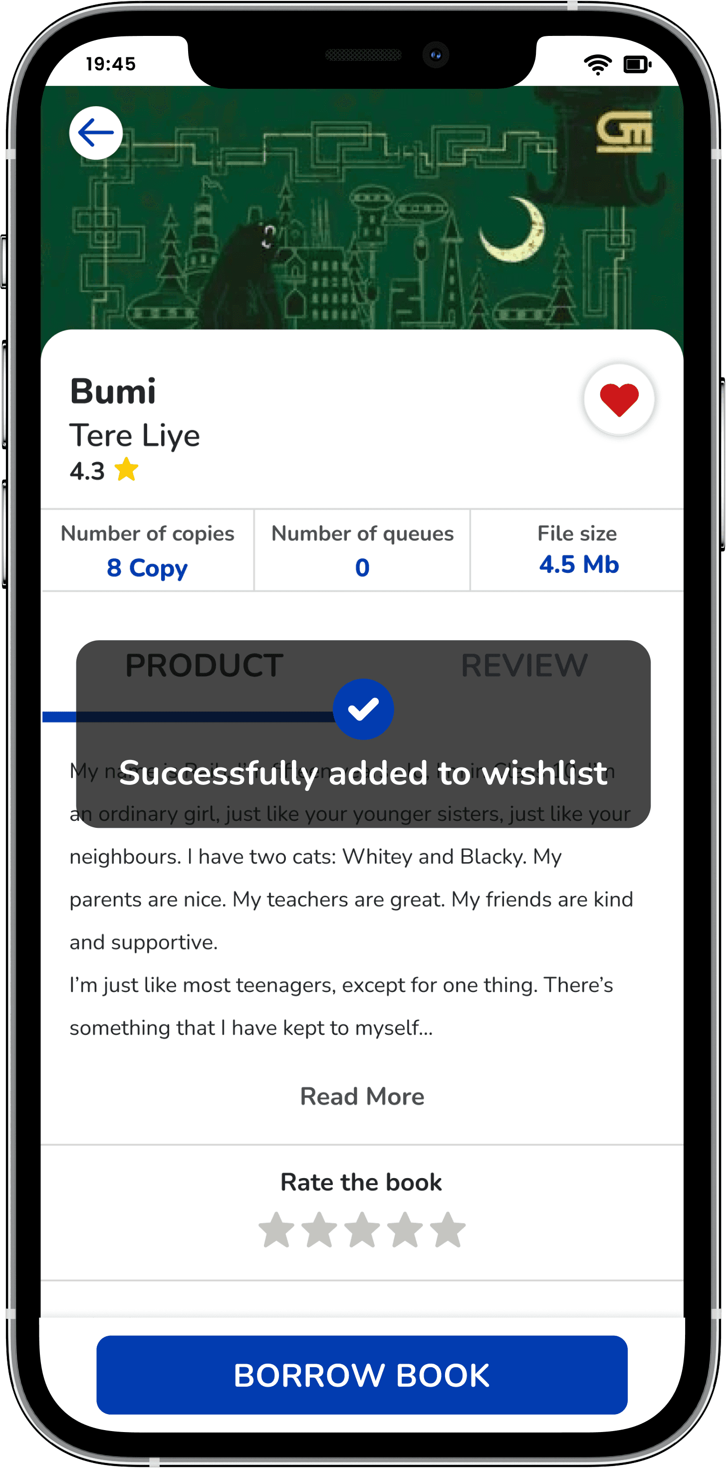
Make it easier for users to store and search for books that they like. When the user uses this whishlist button, the book will be automatically added in the wishlist on the bookshelf page. As an additional update, in the search field there is a search history for the last three keywords.
Try prototype here
Visual Hierarchy
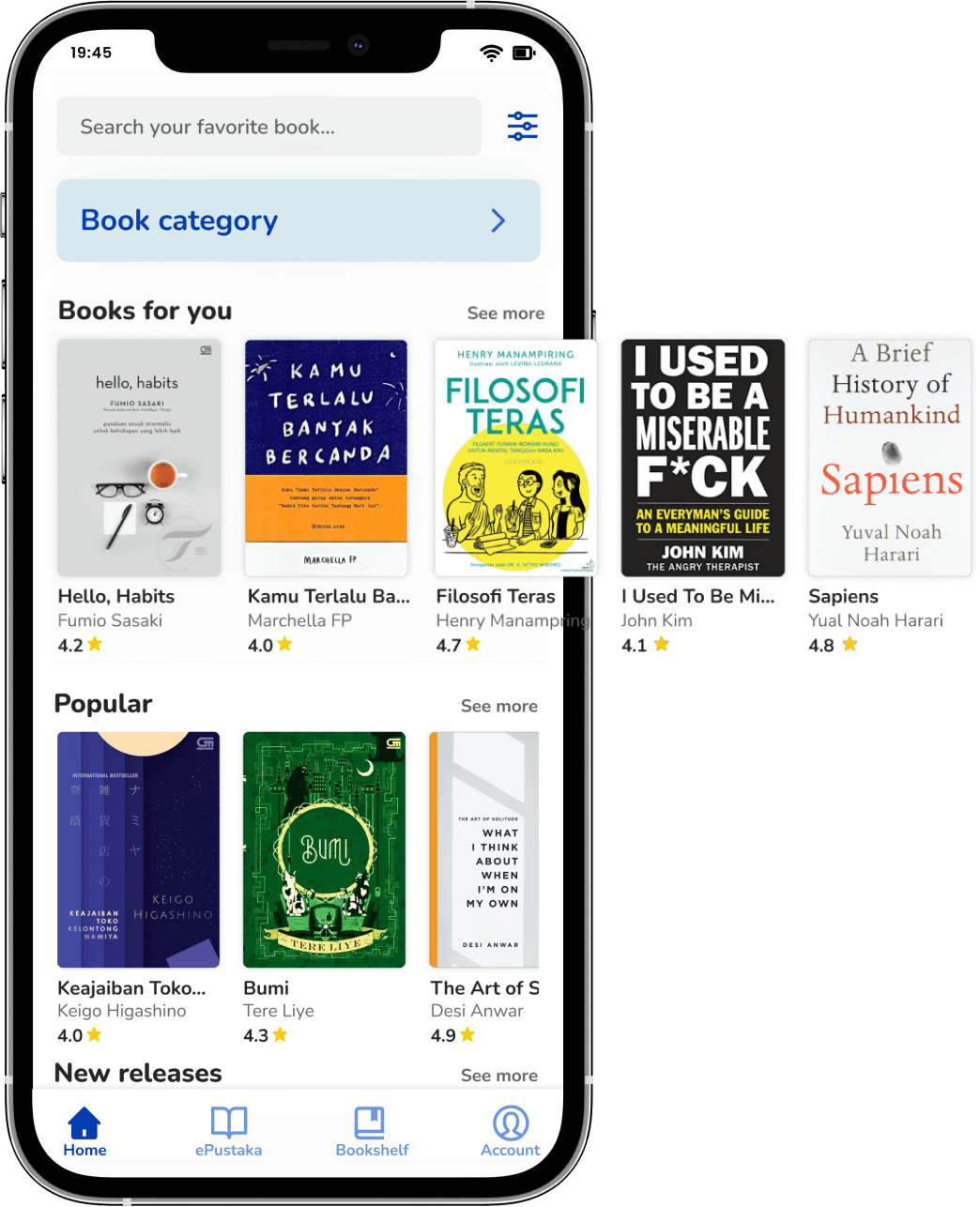
The new design of the iPusnas application applies a visual hierarchy. Each font uses a different font weight and color. The goal is to make it easier for users to capture the arrangement of information on a page
The use of illustrations provide a response to the user for the activities they.
Usability testing
All users agreed that the new design is better and looks more modern than the current iPusnas design. This is because the use of fonts, the layout that is easy to understand by the user, the selection of books displayed, and the visual hierarchy make the whole interface look more modern and attractive.

“Bagusan desain yang baru sih, kalau yang lama tuh tombol tombolnya bingungin. Trus keliatan lebih modern, fontnya baguus dan tampilannya juga bagus.”

“Tampilannya oke, lebih modern, lebih jelas gitu. Apalagi navigation barnya dipindah kebawah kan, jadinya lebih nyaman.”

“Desain yang baru ini lebih mudah dipahami (cara menggunakan) yaa.”

“Kalau isinya kayak gini, senenglah. karena banyak yang update (buku baru & popular) ditampilin di home.”
Design Recommendation based on UT
Takeaways
Here’s what was working based on UT
The wishlist in detail page and recent search features help users save the books when browsing books and remember the latest searched list
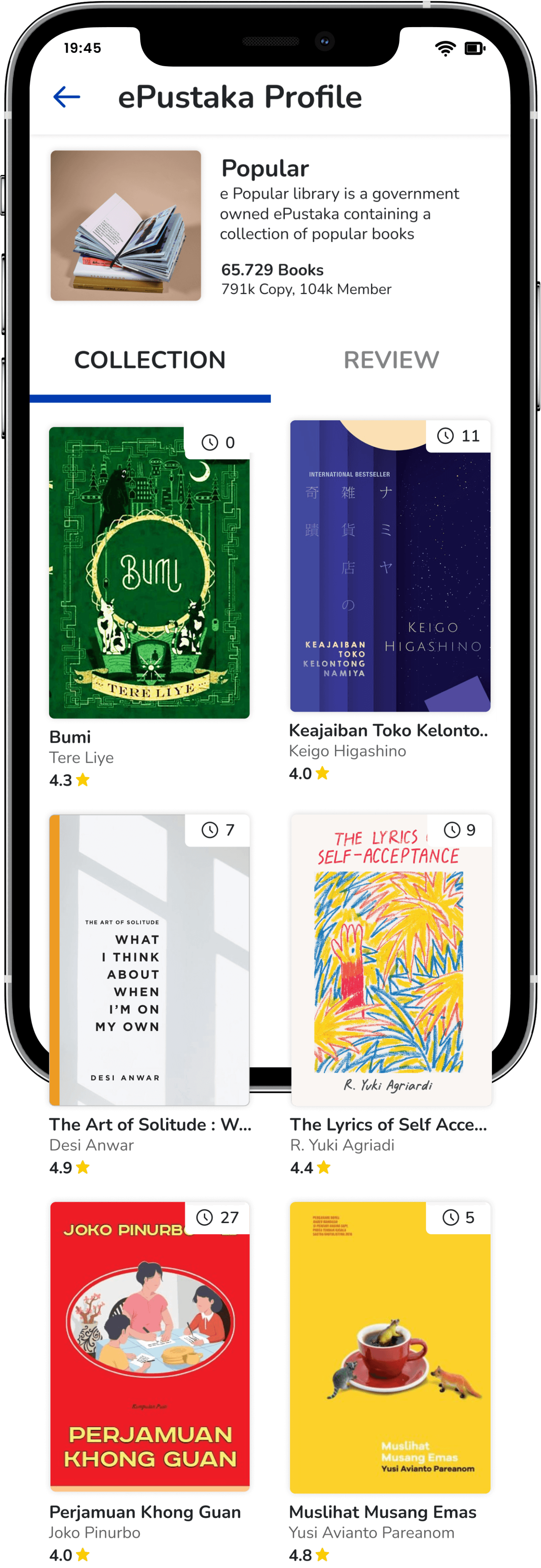
Clear and varied book recommendations on the homepage help users find and browse books by some recommendation categories
The ePustaka tooltip helps users understand the ePustaka features
Here’s where we need continued iteration based on UT
Design development on the book detail page which contains information on the queue number for borrowing books, ebook stocks, ebook file sizes and book ratings. So that the user can find out whether the book is available to borrow. Even if it is not available, the user can find out the number of queues for borrowing
The importance of feedback from the application when the user successfully saves the book to the wishlist as a form of information that the book has been successfully saved
Development of a change in the color of the "Download Book" button when the book has been successfully borrowed. So that users have different information when the book can be borrowed or can be downloaded

Leason Learned
It is my very first time creating a UI/UX case study. During this research process, I learned a lot from users:
It turns out that what I assumed, is not necessarily something the user needs. You are not your user is the best tagline to describe the research process
The importance of learning time management to complete tasks in a narrow time. To speed up work time, when I have problems while working or need another perspective, I will discuss it with friends or mentors. So I don't spend too long on one problem.
While working on it, I learned that doing a UI/UX case study is not easy but I (really) enjoyed the whole process! I ask for feedback from my mentors and friends. The discussion was super fun because I learned a lot of new things. Of course, there is still a lot to improve on this revamped design, please feel free to leave feedback or suggestions.
Made with
in Jember
